Workflow diagrams are the simplest way to see how work really moves through your organization. Here’s how Tallyfy approaches workflow visualization and management.
Summary
- A workflow diagram is a visual map of one process - It uses standardized shapes (rectangles for tasks, diamonds for decisions, ovals for start/end) to show exact steps and who does what, making operations transparent and easier to improve
- Four main types serve different purposes - Process flowcharts for simple sequences, BPMN for formal standardization, swimlane diagrams for cross-department handoffs, and SIPOC for analyzing inputs and outputs of a workflow
- Visualization exposes hidden waste - In discussions we’ve had with operations teams, mapping a process on paper almost always reveals redundant approvals, unnecessary handoffs, and bottlenecks nobody knew existed
- AI agents need these diagrams too - Everyone’s building AI agents right now, but nobody’s building the workflows they need to follow. Without a defined process, AI just automates chaos faster. See how Tallyfy brings workflow diagrams to life
Tallyfy is the only product available that does Process Documentation and Process Tracking in one
I’ve spent more than a decade thinking about how people document and run processes. And after all that time, I’m more convinced than ever that workflow diagrams are underrated. Not the fancy BPMN kind that require a certification to read. The simple kind. The kind you could sketch on a napkin and hand to a new hire on day one.
Here’s why they matter more now than they did five years ago: everyone’s building AI agents, but nobody’s building the workflows those agents need to follow. An AI agent without a defined process is just an expensive random-task generator. That’s the uncomfortable gap most companies are ignoring right now.
What is a workflow diagram
A workflow diagram is a visual representation of a business process or workflow. Usually done through a flowchart, it uses standardized symbols to describe the exact steps needed to complete a process and points out who’s responsible for each step.
The “workflow” concept we use today traces back to two American mechanical engineers: Henry Gantt and Frederick Wilson Taylor. Both contributed to the development of scientific management, and their thinking still shapes how we approach process design.
On its own, a workflow diagram is enormously helpful for analysis. By seeing how the business works from a top-down perspective, you can spot flaws, weaknesses, and areas for improvement that are invisible when you’re stuck inside the process. In discussions we’ve had with operations teams, visual diagrams frequently reveal redundant approval steps that add days to cycle times. One manufacturing team discovered their purchase order process had 7 unnecessary handoffs once they mapped it out. Beyond analysis, the workflow diagram works as a reference for your employees. It’s a way to double-check what needs to be done, who’s responsible, and what comes next. It also pairs well with process management approaches like Business Process Management (BPM) or Business Process Improvement. The pattern is straightforward: with a workflow diagram, you identify weaknesses and potential improvements. With the right method, you develop ideas on how to fix them.
Similar tools and how they differ
Workflows, BPM, mapping, flowcharts - there’s a bunch of overlapping terminology in this space, and it trips people up constantly. Let me clear it up.
Flowchart - A workflow diagram can take the form of a flowchart, but it doesn’t have to. It might also be a SIPOC diagram, a swimlane, or something else.
Business Process Mapping - A workflow diagram graphs one single process. Business process mapping operates at a much higher level. It can mean mapping out multiple processes, data flows, systems, and the people involved across an entire organization.
Business Process Modeling - This involves workflow diagrams, but it goes further. The diagram is just the visualization. Modeling means taking the as-is diagram (how the process works right now), finding improvements, and creating a to-be version (how it should work in the future).
My take? Most teams overthink the terminology and underthink the doing. Pick any of these approaches and start mapping. The act of putting your process on paper is 80% of the value.
Real use cases and examples
Initially, workflows were used specifically for manufacturing. Today, they apply to pretty much any industry with repeatable processes. After watching hundreds of teams try this building workflow tools at Tallyfy, the most common use cases fall into three buckets.
Process Analysis and improvement - Visualization gives you a much deeper understanding of how a process actually works. This information can then be used to find weaknesses or improvements.
Process instruction - A lot of know-how in your company is based on tribal knowledge. If a key employee leaves, the rest of the team can get confused about how to carry out a specific process. If it’s documented visually, they can just consult the diagram.
Tracking and management - Workflow software goes beyond process mapping. It lets you track the process in real-time: who’s responsible for what, what’s the deadline, whether there are any hold-ups.
Calculate your process visualization ROI
See how much time your team could save by visualizing and improving your workflows.
Are you hearing this at work? That's busywork
Enter between 1 and 150,000
Enter between 0.5 and 40
Enter between $10 and $1,000
Based on $30/hr x 4 hrs/wk
Your loss and waste is:
every week
What you are losing
Cash burned on busywork
per week in wasted wages
What you could have gained
160 extra hours could create:
per week in real and compounding value
Total cumulative impact over time (real cost + missed opportunities)
You are bleeding cash, annoying every employee and killing dreams.
It's a no brainer - improve your workflows
Industry-specific workflow examples
You can apply workflows to any industry or process. Here are some practical workflow examples we see regularly.
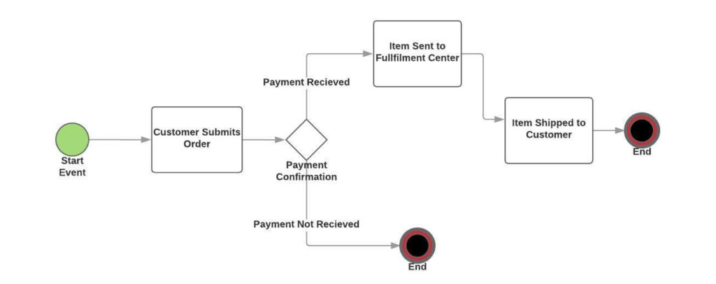
E-Commerce order tracking:
- Buyer submits the order
- Transaction is confirmed and money received
- Responsible employee picks up the item and sends it to the fulfillment partner
- Item is shipped to the buyer
Content Marketing coordination:
- Writer creates a draft and sends it to the editor
- Editor either approves the article and passes it to the designer, or sends it back with revision instructions
- Designer creates the visual assets and sends them to the marketer
- Marketer uploads the article to the CMS, handles search and distribution
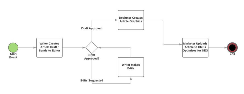
Want to start using workflows for your content management but not sure where to begin? Read our guide on content marketing workflows.
Employee Onboarding:
- HR sends out all the paperwork to the new hire
- New hire sends back the filled-in documents
- HR passes them to management for signature and approval
- Office manager ensures the workspace and company software are ready
- Once the new hire shows up, orientation starts
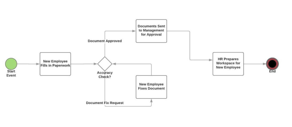
Employee onboarding alone has appeared in over 300 of our conversations with organizations at Tallyfy. It’s consistently the first process teams want to formalize.
Ready-to-use workflow templates
How to create a workflow diagram
Symbols you need to know
Before you create a workflow diagram, you should understand the basic symbols. There are many notation systems (BPMN gets quite complex), but you can start with just four shapes.
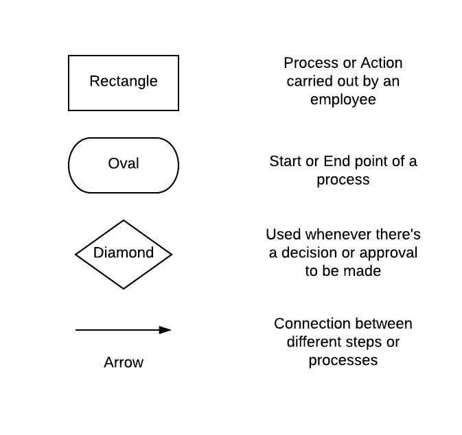
- Rectangle - A task or action step
- Oval - Start or end of the process
- Diamond - A decision point (yes/no, approve/reject)
- Arrow - The direction of flow between steps
That’s it. Four shapes. You can diagram almost any business process with just these.
Picking the right tool
Pen and paper - The simplest option. Grab a pen and draw the process from memory or by talking to the person who runs it.
Flowchart software - Dedicated graphing tools. Since you’ll probably store charts digitally anyway, this saves you from scanning.
Workflow management software - Same visualization capabilities as flowchart software, but with major added benefits. Tallyfy, for example, lets you track the workflow in real-time, automate certain steps, and identify bottlenecks through analytics. The diagram becomes a living, running process rather than a static picture.
Five steps to build your diagram
Step 1: Pick the process to graph. What’s the purpose of this diagram? Onboarding? Process analysis? The purpose determines how much detail you include. For analysis, you’d need to be specific about resource inputs and outputs. For onboarding, you just need roles, responsibilities, and exact to-dos. Also define where the process starts and ends. This keeps you from going overboard.
Step 2: Gather information. Whatever your role, you probably don’t know everything about every process. Talk to the people who run it. Ask: Who’s in charge of each activity? What’s the timeline? Are there possible deviations? Where are the delays? What are the bottlenecks?
Step 3: Design the workflow. Use what you’ve learned to visualize the as-is process. Map the process as it actually runs today, not how you wish it ran. If you’re using the diagram for onboarding or process instruction, you might be done here. For process analysis, keep going.
Step 4: Analyze and improve. Now that you’ve visualized the process, you probably already see things you could improve. I know I usually do after building one. Ask yourself: Are any steps lagging? Can you automate anything? Are certain steps riskier than they should be? Are any steps more expensive than necessary? Techniques like Cause and Effect Analysis or the 5 Whys Method can help structure this thinking.
Step 5: Create a to-be process. Once you’ve figured out improvements, reflect them in an updated diagram. You could just start executing changes, but it’s more effective to show employees the new process visually. They’re far more likely to stick with the new method when they can see it. And if you’re using workflow management software, all you do is update the process template. The next time anyone starts that process, they get the latest version automatically.

Types of workflow diagrams
There are several ways to create workflow diagrams. These four are the most common.
Process Flowchart - The simplest type. Map the process chronologically, step by step.
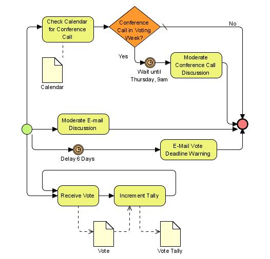
BPMN - A specific flowchart notation that uses standardized symbols and elements. The standardization means anyone familiar with BPMN can read the diagram, even if they’ve never seen your specific process before.
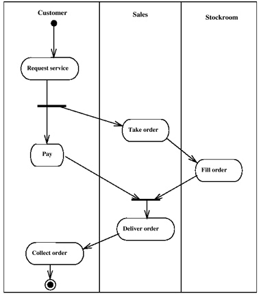
Swimlane - Works like a regular flowchart, but splits the process across different departments or roles. This makes cross-team handoffs visible.
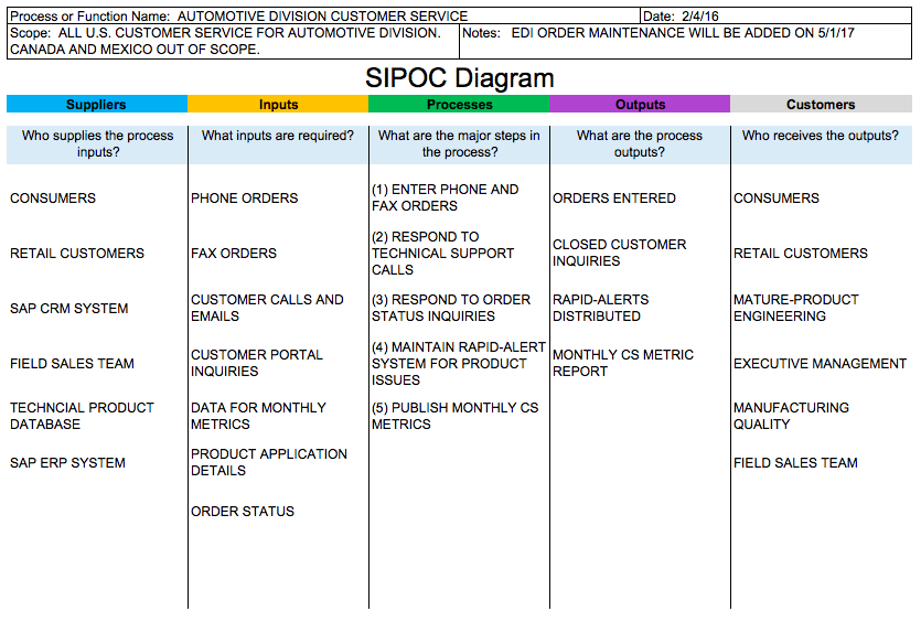
SIPOC - Stands for Suppliers, Inputs, Processes, Outputs, Consumers. Unlike flowcharts, SIPOC doesn’t focus on the order of steps. Instead, it analyzes the most important aspects of a workflow from end to end.
From static diagrams to running workflows
Documenting workflows is helpful. But really? Static diagrams have a shelf life. They go stale. People update the process but forget to update the diagram, and suddenly your documentation is fiction.
This is exactly why we built Tallyfy the way we did. Instead of drawing a diagram that sits in a shared drive collecting dust, you create a living process template. It routes tasks between people automatically, cuts out the chaos of emails and Slack messages, and gives managers a real-time view of where every workflow stands.
On the employee side, you get a dashboard of tasks and to-dos. As a manager, you have a top-down view of all your workflows, deadlines, and bottlenecks. It’s free for up to 5 users. Give it a try and see for yourself.
And here’s something I think about a lot: in the age of AI, defining your processes matters more than ever. Process quality is performance. A broken process automated by AI just breaks faster and at greater volume. The workflow diagram is your starting point for getting the process right before any automation touches it.
Not sure about how to use workflow software? We’ve got you covered with our complete guide. And if you’re comparing different providers, read up on how to pick the right workflow management system.
Related questions
What are the 3 types of process flow diagrams?
The three main types are basic flowcharts (simple shapes connected by arrows), swimlane diagrams (which show who does what across departments), and value stream maps (which focus on time and waste). Simple processes work best with a basic flowchart. Once you need to see cross-team handoffs, swimlane diagrams make more sense. Value stream maps are the go-to when you want to find where time is being wasted.
What is the difference between a flowchart and a workflow?
A flowchart is a map. It lays out steps using shapes and connecting lines. A workflow is the actual sequence people follow to get work done. Think of the flowchart as the blueprint and the workflow as the building. Flowcharts can describe any kind of process, but workflows zero in on how work moves between people and teams.
How to make a workflow diagram in Word?
It’s straightforward. Click Insert, then Shapes, then New Drawing Canvas. Add boxes, arrows, and connectors. Word also has SmartArt graphics built specifically for workflows - find them under Insert, then SmartArt, then Process. You can adjust colors, add text, and move shapes until it looks right. For anything beyond basic diagrams though, dedicated software saves a lot of frustration.
How to create a workflow diagram in Excel?
Excel supports basic workflows through its Shapes feature. Insert shapes, connect steps with connectors, and right-click on shapes to add text. SmartArt under Insert, then Process gives you more control. One tip: zoom out of your spreadsheet view to give yourself more room to work.
What symbols are commonly used in workflow diagrams?
The core symbols are straightforward: rectangles for tasks or actions, diamonds for decision points, arrows for flow direction, and ovals for start and end points. Circles sometimes show connections between diagram sections, and cylinders represent data storage. You can build almost any business process diagram with just these six shapes.
How detailed should a workflow diagram be?
Aim for 5 to 15 main steps for most processes. Simple enough to follow at a glance, detailed enough to guide someone through the work. If a process needs more granularity, break it into sub-processes rather than cramming everything into one massive diagram. I’ve seen diagrams with 60+ steps that nobody ever reads. Don’t be that team.
Can workflow diagrams help improve efficiency?
Absolutely. Visual maps of your process expose bottlenecks, duplicate steps, and unnecessary approvals that are invisible when you’re working inside the process. In our experience at Tallyfy, teams regularly discover steps that can be automated or eliminated once they see the whole workflow laid out. The diagram itself doesn’t improve efficiency, but it makes the waste visible so you can act on it.
What software is best for creating workflow diagrams?
For basic diagrams, Word and Excel work fine. For anything more involved, dedicated tools like Lucidchart, Draw.io, or Visio offer more flexibility. If you want diagrams that actually run as live processes (with tracking, automation, and real-time status), that’s where Tallyfy comes in. Pick software based on whether you need a static picture or a living workflow.
How often should workflow diagrams be updated?
Your diagrams should be living documents, not snapshots. Review them whenever you make a process change, and do a general audit at least every six months. In fast-moving teams, quarterly reviews make more sense. The bigger risk is not reviewing them at all and ending up with documentation that no longer matches reality.
What is the difference between linear and parallel workflows?
In a linear workflow, each step follows the previous one sequentially. Step 2 can’t start until Step 1 finishes. In parallel workflows, multiple steps happen at the same time, which saves time but requires more coordination. Your diagram should make it clear which steps can run in parallel and which must run in sequence. Getting this wrong is one of the most common causes of process delays.
About the author
Amit is the CEO of Tallyfy. He has 25+ years of practical experience in technology, entrepreneurship, and operational efficiency. He's been hands-on with AI-first engineering and changing Tallyfy to AI-native workflow automation since Claude Code was first released. He's also an Entrepreneur in Residence at WashU's Skandalaris Center, created the OneDay (Woolf) AI curriculum for their accredited MBA and consults with clients who need help with AI via Blue Sheen. He graduated with a Computer Science degree from the University of Bath. He's originally British and lives in St. Louis, MO.
Find Amit on his website , LinkedIn , or GitHub . Read Amit's bio →

Automate your workflows with Tallyfy
Stop chasing status updates. Track and automate your processes in one place.