Pareto analysis helps you zero in on the handful of issues driving most of your results. Here’s how we approach process improvement at Tallyfy.
Summary
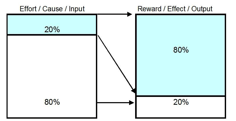
- 80% of problems come from 20% of causes across almost every field - Vilfredo Pareto first noticed this pattern in Italian wealth distribution in 1906, and Joseph Juran later proved it applied to quality defects, software bugs, sales revenue, and even workplace injuries
- Pareto charts rank problems visually from worst to least - A bar chart ordered by frequency plus a cumulative percentage line that lets you eyeball whether the 80/20 split holds for your data, so you know exactly where to aim your effort
- Six Sigma relies on Pareto analysis during the Measure and Analyze phases - The DMAIC framework uses Pareto charts to separate the vital few causes from the trivial many, keeping teams from spreading their resources too thin across every possible issue
Tallyfy is Process Improvement Made Easy
What Pareto analysis is and where it came from
A Pareto chart is a statistical tool that ranks problems from the most frequent to the least frequent. The whole point? Focus your energy on the stuff that actually moves the needle.
In 1906, Italian economist Vilfredo Pareto noticed that roughly 80% of Italy’s land and wealth belonged to about 20% of the population. He ran similar surveys across other countries and found the same lopsided pattern everywhere. The story goes that he even spotted it in his garden - 20% of his pea pods produced 80% of the peas. Decades later, a Romanian-born American management consultant named Joseph Juran took Pareto’s observation and turned it into something practical. During the 1940s, Juran applied the 80/20 ratio to quality control and proved it was, as he put it, a “universal” principle. He’s the one who coined the term “Pareto Principle” and later refined it to “the vital few and the useful many” - because dismissing the other 80% isn’t quite right either. The brilliant part of Juran’s take is that it gave managers a lens for prioritization that didn’t require advanced math or expensive consultants. You just had to count things straight and sort them.

The relationship is shown below. Two variables always share the same lopsided ratio.
Here’s where it shows up across different fields:
- Business - 80% of the work gets done by 20% of the team members
- Software - 80% of errors trace back to 20% of the bugs. Microsoft’s then-CEO pointed out that fixing the top 20% of bugs by frequency resolved about 80% of user issues
- Sales - 80% of revenue comes from 20% of accounts
- Health and safety - roughly 80% of workplace injuries stem from 20% of hazards
- Crime - 80% of crimes are committed by 20% of offenders
The 80/20 rule isn’t a physics law. It’s a power-law distribution pattern that shows up so consistently across domains that ignoring it feels reckless. After watching hundreds of teams try this at Tallyfy, we’ve seen this ratio hold in workflow bottleneck analysis again and again - a small handful of process failures cause the vast majority of delays.
When Pareto charts are worth your time
Not every situation calls for a Pareto chart. But anytime you’re trying to figure out where to focus limited resources for maximum impact, it’s probably the right tool.
The common thread across every use case is optimization. It doesn’t matter whether you’re optimizing code, a business process, workflows, or documentation practices. Pareto analysis helps you find the pattern that generates the greatest return.
Your data needs to meet two criteria:
- It must be sortable into categories - things like defect types, complaint categories, or cost buckets
- The ranking has to matter - if no category is more important than another, frequency becomes meaningless and you need different categories
Several well-known companies have applied this thinking in unexpected ways. Tony Hsieh at Zappos, for example, requires leaders to spend at least 20% of their time socializing with their teams instead of working nonstop. The difference between this and periodic team building activities is that Pareto thinking demands continuous application, not occasional events. That investment in the “vital 20%” of bonding time paid off in trust and team cohesion.
In practical terms, Pareto charts are most useful for:
- Identifying which problems deserve your attention first
- Presenting issues to leadership in a simple, visual format
- Figuring out the frequency of specific problems in your operation
I think most teams skip this step. They jump straight to fixing whatever’s loudest rather than whatever’s most frequent. That’s a mistake.
How to build a Pareto chart step by step
To build one, you need to understand the components. A Pareto chart is a bar chart with a twist.
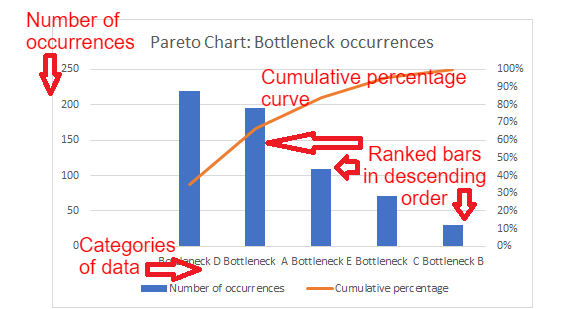
The x-axis shows your problem categories. The y-axis shows how many times each problem occurred. Bars go from tallest (most frequent) on the left to shortest on the right. Then a cumulative percentage line curves across the top, letting you see at a glance whether a few categories account for most of the total.
Here’s a quick summary of the components:
- x-axis - categories of data (bottleneck types, defect classes, complaint reasons)
- y-axis - number of occurrences
- ranked bars - ordered from most frequent to least frequent, left to right
- cumulative percentage curve - shows the running total percentage as you move across categories
Let’s walk through building one using a fictional business scenario. Say you want to find which bottlenecks appear most often in your workflow.
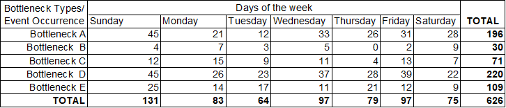
Step 1 - Pick your categories. In this case, different bottleneck types: A, B, C, D, E.
Step 2 - Decide on your measurement. We’ll count how many times each bottleneck occurred.
Step 3 - Set a time window. One week, one sprint, one month - whatever makes sense.
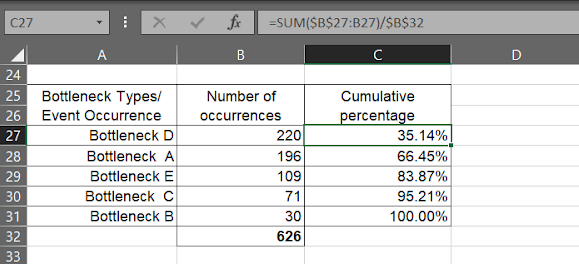
Step 4 - Collect and organize the data in a table with two columns: bottleneck type and number of occurrences.
Building it in Excel
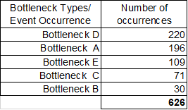
Step 5 - Put everything into an Excel table. Sum up total occurrences using Excel’s summation tools or just a calculator.
Step 6 - Consolidate totals for each bottleneck category and sort them in descending order.
Step 7 - Calculate the cumulative percentage for each bottleneck. The formula is straightforward - drag it down from the first cell.
Step 8 - Select the data (without the total row), go to INSERT > CHARTS > 2D COLUMN > CLUSTERED COLUMN.
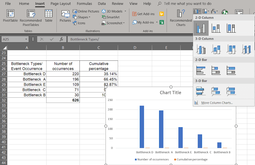
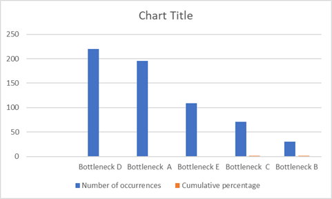
This creates a basic column chart:
Step 9 - Right-click any bar, select “Change Series Chart Type.” In the Combo section:
- Keep number of occurrences as Clustered Columns
- Change cumulative percentage to Line and check the Secondary Axis box
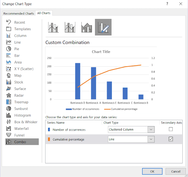
Step 10 - Hit OK, add a title, format the secondary axis as percentage. Done.
Reading the finished chart
Here’s where most people get tripped up. Building the chart is mechanical. Interpreting it is where the value lives.
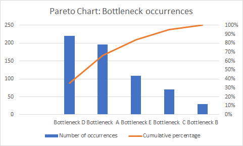
In this example, Bottleneck D and Bottleneck A together account for roughly 80% of all occurrences. That’s your vital few. Fix those two and you’ve addressed the lion’s share of the problem. The other three bottlenecks combined barely make a dent by comparison.
OK, the ratio won’t always be a clean 80/20. This is what Pareto thinking does - it stops you from spreading effort evenly across five problems when two of them cause nearly everything.
Pareto charts in Six Sigma and quality control
One of the most useful applications of Pareto analysis sits inside the Six Sigma framework. Pareto charts serve as visual tools within DMAIC (Define, Measure, Analyze, Improve, Control) - specifically during the Measure and Analyze stages where teams need to figure out which defects or issues deserve attention first.
ASQ (American Society for Quality) describes the Pareto chart as a fundamental quality improvement tool because it visually separates the “vital few” from the “trivial many.” When you’re selecting which project to take on, resources are finite. A manager has the same 24 hours as everyone else. If they want the best results, they need to tackle the projects with the greatest impact first.
What makes Pareto analysis useful - and I’ve seen this play out in workflow implementations at Tallyfy - is how it forces a “manage by fact” philosophy. Instead of arguing over gut feelings about what’s broken, you’re looking at actual occurrence data. The conversation shifts from “I think bottleneck B is the real problem” to “the data shows bottleneck D accounts for 35% of all occurrences.”
That shift matters more than most people realize. Gut feelings lose to spreadsheets every time.
There’s another angle worth mentioning. Once you’ve identified which defects deserve attention through Pareto analysis, you’ve created a ranked list of where to dig deeper. The top items become starting points for root cause analysis - whether that’s a fishbone diagram, 5 Whys, or whatever your team prefers. Pareto doesn’t tell you why something is happening, but it tells you exactly where to start asking that question.
Why Pareto matters more in the age of AI
Here’s something that doesn’t get enough attention. Everyone’s rushing to automate processes with AI.
If you throw an AI agent at a workflow you haven’t analyzed - one where 80% of delays come from two root causes you haven’t identified - you’re basically just automating the bottleneck. The failures happen faster now. Congratulations.
This is why we built Tallyfy the way we did. Before you automate anything, you need to see where the problems are. Pareto analysis gives you that visibility. At Tallyfy, we’ve observed that teams who run a simple Pareto analysis before setting up workflow automation typically cut their implementation time in half because they’re not automating broken steps.
The question we get asked most often by operations managers at mid-size companies is “where do we even start?” - and a consistent pattern emerges: the top 3-5 issues surface within the first analysis session. One payroll processing company reduced onboarding time by 64% after a Pareto chart revealed that information collection errors caused the majority of delays. They didn’t need AI for that insight. They needed a bar chart and clean data.
The sequence that works is straightforward. Run a Pareto analysis first. Fix or redesign the vital few problems. Then automate what’s left with tools like Tallyfy. Skipping the analysis step is how companies end up with expensive automation that makes messy processes run faster.
Putting it into practice
Look, Pareto analysis isn’t complicated. That’s its strength. Does it work every time? No, but it works often enough to matter. You don’t need a statistics degree or specialized software. Excel works fine. Even pen and paper works.
The real challenge isn’t building the chart. I learned this the hard way at Tallyfy - it’s being straight about what the data shows. Sometimes the vital 20% of causes isn’t where you expected. Sometimes the fix is uncomfortable - maybe it’s a people problem, not a technology problem. Maybe the bottleneck is a step that someone important designed and doesn’t want changed.
My suggestion? Start small. Pick one recurring process that frustrates your team. Track the problems for a week. Categorize them. Build the chart. Let the data tell you where to focus.
From our experience across hundreds of workflow implementations at Tallyfy, teams that do this one simple exercise before jumping into automation see dramatically better results. The 80/20 rule isn’t just a nice theory - it’s probably the most practical tool you’ll find for figuring out what deserves your attention and what doesn’t.
Want to identify and fix your biggest process bottlenecks? See how Tallyfy helps you document, track, and improve your workflows before automating them.
