Gantt charts become even more useful when paired with work management software that tracks task completion in real time.
Summary
- A Gantt chart maps tasks against a timeline using horizontal bars - each bar’s length shows duration, and the vertical axis lists every task grouped by project phase, so you can spot overlaps and gaps at a glance
- Henry Gantt invented the format around 1910-1915 to track factory quotas - black bars meant targets hit, red bars meant missed, and the model later shifted to time-based scheduling during World War I
- Progress and linked variants serve different jobs - progress charts shade bars to show completion percentage, while linked charts draw dependency lines between tasks, though those lines get messy fast on bigger projects
- A chart alone won’t fix a broken process - pairing a Gantt chart with a workflow tool like Tallyfy reveals who’s stuck and why, not just that something’s behind schedule. See how Tallyfy tracks work
Work Management Made Easy
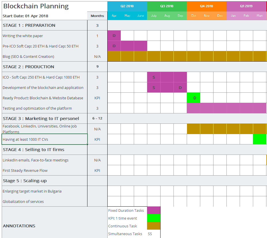
A Gantt chart is a horizontal bar chart that shows project tasks plotted against time. That’s it. Nothing magical. OK, that oversimplifies it a bit. Each bar represents one task, its left edge marks the start date, its right edge marks the end date, and the length tells you how long it should take. You can read one in about thirty seconds.
Why does that matter? Turns out, most project failures aren’t caused by people not knowing what to do. They’re caused by people not knowing what everyone else is doing. A Gantt chart fixes that by making the full schedule visible to the whole team.

But here’s what I’ve learned after years of building workflow software at Tallyfy: The same applies to Gantt charts. A beautiful chart built on top of a disorganized process just gives you a pretty picture of chaos. The chart is only as good as the thinking behind it.
Why Gantt charts still work
When you’re kicking off a new project and you don’t have any kind of visual schedule - no Gantt chart, no PERT diagram, nothing - you should probably pause and rethink whether you’re ready to start at all.
Think of it like buying a map before visiting a new city. Most people skip the map because it costs time upfront. Some skip it because they like the adventure. Fair enough. But if you’ve traveled before, you know that planning ahead costs a bit initially and then saves you a ton of time later. You see more, waste less, and don’t end up lost at midnight in a neighborhood you didn’t mean to visit.
Adventures are great - unless you’ve got a deadline.
A Gantt chart works the same way. It feels like overhead at first. But as the project moves forward, you start seeing which tasks overlap, where the bottlenecks live, and what’s about to go off the rails. That visibility is worth the upfront effort. Something I’ve noticed across industries is that teams who resist visual scheduling early on become its biggest advocates about two weeks into a project - once they’ve had the experience of catching a conflict before it derailed a milestone.
In our conversations at Tallyfy, we’ve heard this pattern repeatedly. Mid-market companies - roughly 55% of the discussions we have - tell us that visual scheduling either brings clarity or creates confusion, depending on how it’s set up. One organization evaluated over twenty different project management tools before choosing an approach. They rated everything on simplicity, task assignment, internal communication, and integration. The lesson? Pick the right tool, but fix the process first.
A brief history
Henry Laurence Gantt, a colleague of Frederick Winslow Taylor, invented the chart somewhere between 1910 and 1915. (Yes, it’s named after him. Shocker.) Originally, it wasn’t about scheduling at all - it tracked worker productivity. A black bar meant an employee hit the daily quota. A red bar meant they didn’t.
Then it evolved. The format shifted from quantity-based tracking to time-based planning, and American strategists used it during World War I to coordinate logistics.
The tools for drawing Gantt charts have gone through their own evolution:
- Pen and paper - Any change to task order or duration meant redrawing the entire chart from scratch. Painful.
- Desktop software - Personal computers brought dedicated project management apps that could generate charts digitally. Faster, but still siloed.
- Web-based tools - The internet made it possible to create, share, and update Gantt charts collaboratively. Most modern tools offer templates, drag-and-drop editing, and built-in guidance. Drawing one on paper today would feel absurd.
How they’re structured
Two things make up the core of every Gantt chart: tasks and durations.
Tasks sit on the vertical axis, listed from top to bottom like a to-do list. They’re usually grouped into blocks representing different project phases - analysis, design, testing, launch, whatever your project demands. Each block gets its own color so you can visually separate the phases.
Durations show up as horizontal bars stretching across a timeline. The left edge of a bar is the start date. The right edge is the end date. The longer the bar, the longer the task takes. Simple.
You can think of the whole thing as a color-coded pipeline showing which tasks happen when, how they relate to each other, and where the schedule gets tight.
Turn your Gantt chart into trackable workflows
Progress vs. linked charts
There are two main Gantt chart variants, and they solve different problems.
Progress Gantt charts shade each task bar from the left to show how much is done. If a task is 75% complete, three-quarters of the bar is filled in. This is brutally useful. If a task was supposed to wrap up last week but it’s only 60% shaded, that’s a red alert. Something’s wrong and someone needs to act. The shading doesn’t lie - it’s the simplest possible way to see whether reality matches the plan, and you won’t find a PM tool that communicates status faster than a half-filled bar against a deadline line.
A question that keeps coming up at Tallyfy is why teams love progress charts in the first two weeks of a project and then stop updating them. The answer is almost always the same - nobody’s enforcing the updates. That’s the gap between a drawing tool and a workflow tool.
Linked Gantt charts draw lines between tasks to show dependencies. Task B can’t start until Task A finishes? A line connects them. The problem is that on bigger projects with dozens of interdependent tasks, those connecting lines turn into a tangled nightmare. The visual clarity disappears. Good luck making sense of that.
Linked charts work well for simple workflows where dependencies are few and straightforward. Once a workflow gets complicated - and they always do - the dependency lines create more confusion than they solve.
Tools for creating Gantt charts
Drawing a Gantt chart on paper is dead. Nobody does it. Is that a loss? Not really. Here’s what people use instead. You’ve got more options than you probably need.
Microsoft Excel remains one of the most common options. You create a table of tasks with start and end dates, convert it into a horizontal bar chart, then format it to look like a proper Gantt chart. There are plenty of video tutorials covering this. For small projects, you can probably find a free template online and skip the formatting work.
Google Sheets does the same thing if you don’t have an Office subscription. You can also install the Gantt Chart Generator extension for Chrome, which auto-generates charts with up to five task levels.
Draw.io - Draw.io is one of my favorite open-source tools. It offers two Gantt chart templates under its “Table” section (they call them “Gantt Tables” for some reason). Templates save time. Let’s be real - whoever built the template spent hours on it, and all you have to do is swap the colors and fill in your tasks.
Microsoft Visio - For bigger, more elaborate projects, some teams use Microsoft Visio. It has drag-and-drop tools and templates, but the learning curve is steep and the subscription cost adds up fast. The real limitation? Your Gantt chart stays static. It doesn’t track whether tasks are actually getting done or alert you when something falls behind. You can connect Excel data to Visio for automated chart generation, but it’s still at core a drawing, not a tracking tool.
I’m not convinced that any static charting tool - no matter how polished - can replace a system that actually tracks work in real time. It just can’t.
Pairing a Gantt chart with workflow tracking
Here’s where it gets interesting. A Gantt chart tells you what should happen and when. A workflow management tool like Tallyfy tells you what’s actually happening and who’s responsible.
Say your progress Gantt chart shows a task stuck at 30% when it should be finished. The chart tells you there’s a problem. But it doesn’t tell you why. Is one person overwhelmed? Did a handoff get dropped? Is the task waiting on something from another team?
That’s where Tallyfy fills the gap. You can see exactly which people are assigned, where the bottleneck sits, and what decisions need to happen. Maybe you reassign the task. Maybe you bring in someone who’s performed well on similar work. Maybe the task needs to be broken into smaller pieces.
From what I’ve observed across hundreds of implementations, the chart alone never tells the full story. A consumer goods company we worked with had project requests routing to six different teams for estimation. Without proper tracking, the same request would sit in limbo for weeks. The Gantt chart showed the timeline was slipping. The workflow tool revealed who was holding things up.
Project management is dynamic. You can’t just plan and walk away. You need to plan, monitor, adjust, and keep adjusting. The combination of visual scheduling and real-time workflow tracking gives you both the bird’s-eye view and the ground-level detail.
And let’s be real - you’d be the first project manager in history if your team hit every deadline and finished every task on time. Even when everything goes well, scope creep kicks in. Task lists change. The critical path moves. That’s normal. The question isn’t whether your plan will change - it’s whether you’ll see the change coming.
What a Gantt chart won’t do
I think it’s worth being straight about the limits. A Gantt chart won’t manage your process for you. It won’t send reminders. It won’t reassign work when someone’s overloaded. It won’t tell you that step four has been stuck for three days because the approver is on vacation.
For that, you need something that runs the process - not just displays it. That’s the difference between a planning tool and a workflow tool. Both matter. But if I had to pick one, I’d pick the tool that tracks real work over the one that draws a pretty timeline.
The best setup? Use both. Map your project visually with a Gantt chart. Run it day-to-day with a workflow tool that holds people accountable. That’s how you keep projects moving without losing your mind.
