Why we obsess over empty states
What users see when there is nothing to see reveals product philosophy. At Tallyfy, reducing 47 features to three initial choices taught us that empty states are the highest-stakes design moment in any workflow tool.
Summary
- Empty states reveal product philosophy - What you show when there is nothing to show communicates everything about how you think users should feel
- The single-player problem is existential - A new user alone in an empty tool will do nothing unless you give them something to do
- Progressive disclosure beats feature overload - Hide non-essential elements and show only the core workflow until users are ready for more
- Hand-drawn sketches outperform polished mockups - Real design conversations happen fastest with paper and pen, not Figma
- Every finished state is also an empty state - Completion screens need the same care as first-time experiences
Most product teams treat empty states as an afterthought. A placeholder. Something to fill in after the real features ship.
This is exactly backwards.
This is our candid experience building empty states at Tallyfy. This reflects our experience at a specific point in time. Some details may have evolved since, and we have omitted certain private aspects that made the story equally interesting.
Onboarding and empty states directly affect workflow adoption. Here is how we approach workflow management.
Workflow Made Easy
The single-player problem
Here’s the core insight that drives everything we do with empty states at Tallyfy:
“I believe that if people do not know what to do, they will do nothing (in single player mode). How do we create an illusion of ‘things you need to do’, especially in empty states?”
Design discussion, January 2020
That sentence captures years of watching users sign up, see an empty screen, and leave. The problem isn’t that they dislike the product. The problem is they have no idea what to do next.
When you open a new account in any workflow tool, you’re a single player. No teammates. No processes. No data. Just you and a blank canvas that offers zero guidance on what canvas is even for.
This problem showed up repeatedly in our internal discussions. From a ticket about first-time user experience:
“New users without prior experience struggle with first interactions.”
And from another discussion about the template library:
“Empty template library - new trial users see essentially empty library.”
The pattern was consistent. Users would sign up, land on an empty screen, and freeze. Not because the product was confusing, but because emptiness doesn’t provide any affordance for action.
After watching hundreds of teams try this onboarding digital marketing agencies managing 20-30 simultaneous web development projects, the feedback was direct: “Relied on Google Workspace and ClickUp but struggled with outdated processes.” Their new hires would spend weeks or months getting up to speed, partly because nobody knew where to start. When we reduced developer onboarding from weeks to 1-2 business days at one agency, a significant part of that improvement came from eliminating empty states that left new team members guessing what to do next.
I wrote about this back in November 2017:
“We should really roll out an empty-state graphic… it would prevent a lot of user helplessness on what to do next.”
The key distinction that took us a while to articulate:
“Note that empty-state design/visual is not the same as onboarding. Onboarding is just for first-time experience.”
Turns out, empty states are permanent. Every new filter, every cleared inbox, every completed workflow creates an empty state. Onboarding happens once. Empty states happen forever.
Progressive disclosure as design philosophy
Honestly, one of the hardest lessons in workflow software: complexity kills adoption.
From our GitHub discussions on progressive disclosure:
“Hide non-essential elements and show only the core workflow: CREATE > VIEW > LAUNCH.”
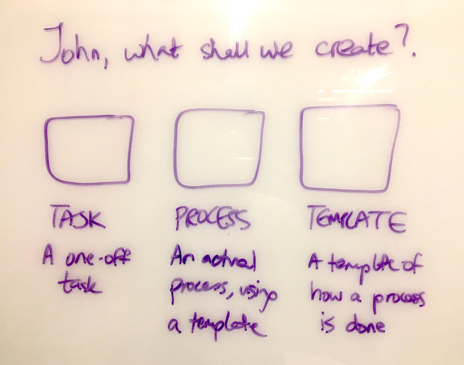
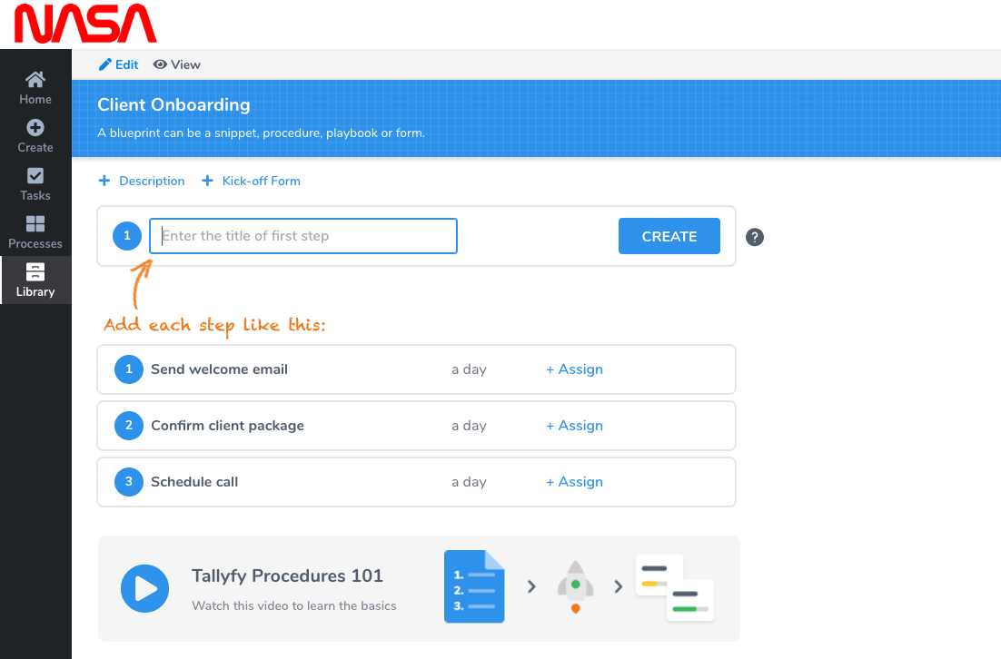
This became a design principle. Instead of showing users all 47 features on day one, show them three things they can actually do. The rest can wait.
The sketch above shows the earliest thinking about constraining user choice. Instead of a blank screen with a complex menu, ask one question with three possible answers:
- Task - A one-off task
- Process - An actual process, using a template
- Template - A template of how a process is done
Each path leads somewhere different. But the user only has to make one decision at a time.
This connects to what we learned about filter empty states. From an internal ticket about empty state improvements:
“The current empty state doesn’t clearly communicate what happened.”
When a user filters their view and gets no results, they need to understand why. “No results” isn’t enough. Did they filter too aggressively? Is there actually no data? The empty state needs to diagnose the problem, not just report it. Which sounds obvious, but almost nobody does it.
The design evolved through real conversations
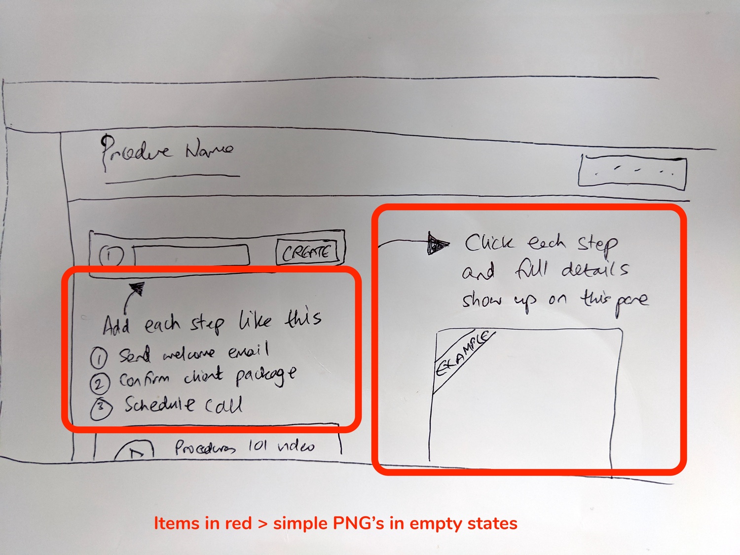
What you see above is how empty state design actually happens. Not in Dylan Field’s Figma. On paper.
The sketch from October 2017 shows the earliest thinking about what a new user should see when they have no templates. But the real evolution happened in conversations between our product designer Thomas and the team.
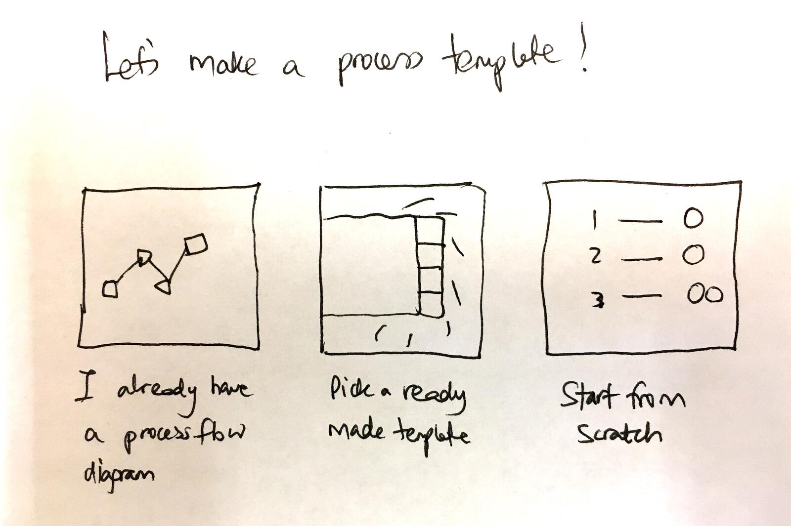
This later sketch refined the thinking. When a user wants to create a template, they have three different starting points:
- “I already have a process flow diagram” - Import existing documentation
- “Pick a ready made template” - Start from our template library
- “Start from scratch” - Build from nothing
Each path addresses a different user need. Some users arrive with existing process documentation. Others want to see what good looks like first. Mind you, a few want complete control from the start.
Reading Time: 5 minutes Best For: New Tallyfy users, team leads, and anyone setting up their first workflow What You'll Get: You'll create your first template, invite your team, and launch a real process This is your hands-on quick start guide for Tallyfy. You'll learn the four building blocks -- t...
View templateBy January 2020, Thomas proposed something elegant:
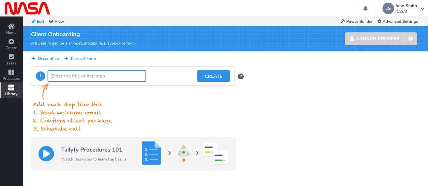
The response to that design was immediate and positive, but with refinement:
“Only one suggestion before I suggest going to GitHub and A/C - on the first screenshot of steps - could the 1, 2, 3 look like our actual steps UI?”
Small details matter. If you’re showing users what their future looks like, it needs to look like the real thing. Otherwise you’re just adding noise.
Show the destination, not just the starting point
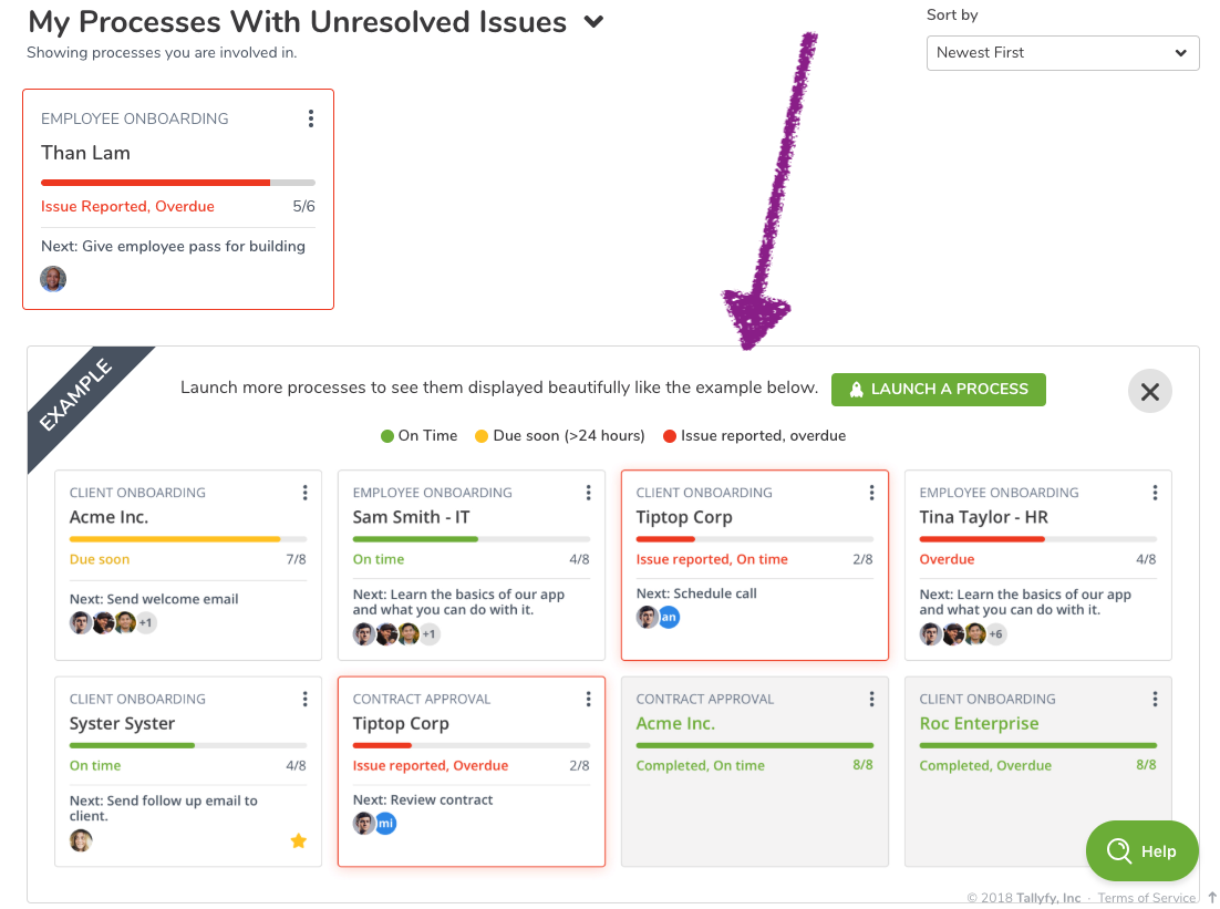
One of the more counterintuitive discoveries: people sort of need to see what success looks like before they will take the first step.
The tracker empty state doesn’t say “You have no processes.” It shows you what processes in progress would look like. The distinction is subtle but critical - you’re selling the future, not describing the present.
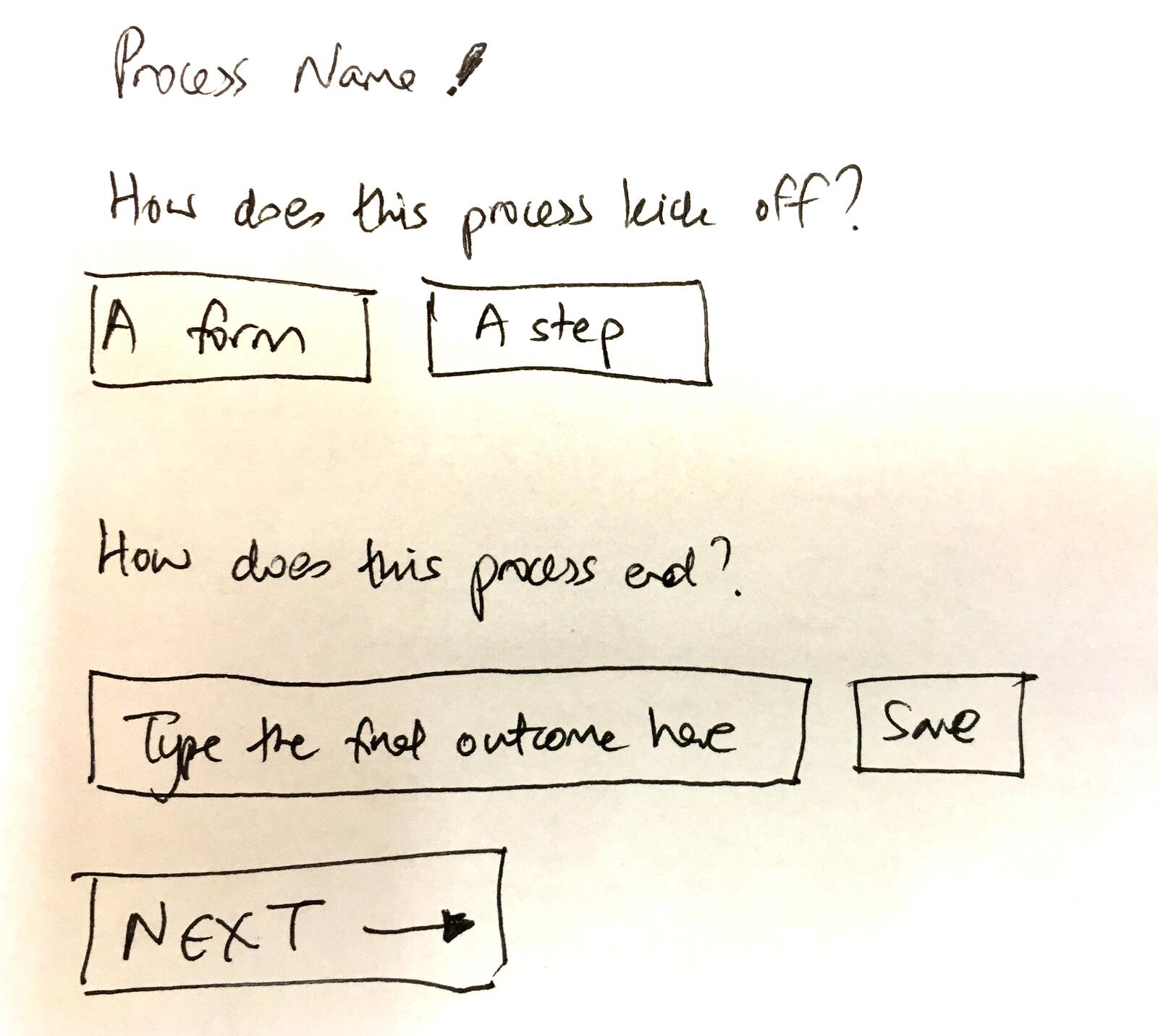
This sketch captures the philosophy perfectly. Instead of overwhelming users with a complex form, ask two questions:
- “How does this process kick off?” - A form or a step?
- “How does this process end?” - Type the final outcome
That’s it. Everything else can come later. But these two questions frame the entire mental model: a process has a beginning and an end, and everything in between is just steps.
This connects directly to the philosophy behind how we think about buttons. Every UI element is either pulling users forward or pushing them away. Empty states are high-stakes because they happen at moments of maximum uncertainty.
The loading state trap
I learned this the hard way at Tallyfy. One pattern that caused real user confusion: the endless loading state.
From an internal discussion about empty state improvements:
“Templates without processes show endless loading dots.”
When there’s nothing to show, you have two choices: show an empty state or show a loading state. The trap is showing a loading state when there’s genuinely nothing to load. Users will wait forever for something that’s never coming.
The fix required distinguishing between “we’re loading data” and “we loaded data and there’s none.” Seems obvious in retrospect. But the default behavior of many UI frameworks is to show a spinner until data arrives. If no data ever arrives, the spinner spins forever.
This is why we explicitly design for three states:
- Loading - We are fetching data, please wait
- Empty - We fetched data and there’s none
- Error - Something went wrong
Each needs its own design. Conflating them creates confusion.
The hand-drawn approach works better
This photo from a January 2020 design session shows how the thinking evolved. The sketches explore multiple approaches simultaneously:
- What graphic goes in the empty space?
- What text explains what to do?
- Where does the call-to-action go?
- How does this differ for procedures vs. forms vs. documents?
The advantage of paper is speed. You can explore five ideas in the time it takes to open Figma. And nobody gets attached to a sketch the way they get attached to a polished mockup.
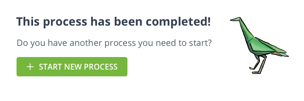
Completion states are also empty states
Here’s something most teams miss: a finished workflow is also an empty state. The user has nothing left to do. What happens next?
“Once a process is finished, it looks a bit barren, in terms of ‘what next?’ … Have we had any feedback about what users want to do as soon as they finish a process?”
Design discussion, August 2018
The answer was honest:
“No idea. Either Mixpanel helps or we just need to decide for them to increase their level of engagement.”
Sometimes you don’t have data. You make a decision based on principles and see what happens. Is that ideal? Not really, but it beats paralysis. The principle here: never leave users at a dead end.
For guidance on what users can do after completing a process, see our documentation on tracking and tasks.
The disagreement that shaped everything
Not every design decision was smooth. The team debated extensively about onboarding flow complexity:
“The last demo call I had I saw how painful the current onboarding seemed. It is currently: 1. Click START TALLYFYING 2. Fill out form 3. New page with plan selection and required form field 4. Reveal new form with more fields to fill out (Most people do not want to put their number in) Accept terms, click submit. 5. Log in. Adding ‘invite users’ is great but at present it is just too much to ask the user before they have even seen the product.”
Thomas, January 2020
This is a real tension. You want user data to personalize the experience. But every form field is friction. And friction before someone sees any value is the fastest path to abandonment.
The compromise: collect essential data upfront, then ask for additional context inside the product after users have experienced some value.
“We need to get them into the product as fast as possible. Then ask questions.”
This principle shaped our entire onboarding philosophy. The empty state isn’t the place to collect user data. It’s the place to show users what’s possible.
Context changes everything
One technical detail that matters more than it seems: empty states need to be context-aware.
From the GitHub issue that shipped this feature:
“Show design A when BPE has less than 1 step. Show design B when BPE = 1 step. Do not show any design when BPE has more than 1 step. Only apply to tagged #procedures.”
The empty state for a procedure with zero steps is different from a procedure with one step. And document types need different guidance than procedure types. Generic empty states are broken because they treat all emptiness as equivalent.
Feature activation to hide complexity
Several ideas were discussed that shaped our thinking about progressive complexity:
Feature activation as progressive disclosure. There was an extensive 2017 discussion about making features feel like gifts to unlock. The idea was that even features included in your plan would start “deactivated” and clicking to activate them would create engagement. Instead of showing 47 features on day one, show 5 core features and let users unlock the rest as they need them.
“Feature activation can hide complexity. New users see CREATE > VIEW > LAUNCH. Advanced users see everything.”
This approach means the empty state for a new user looks fundamentally different from the empty state for a power user. The new user sees simplified options. The power user sees the full toolkit.
Animated celebrations. The team explored adding sparkle animations and confetti when users completed their first action. The concern was that gratification animations can feel a bit patronizing if users see through them.
Personality in copy. Earlier iterations had more playful language in empty states. This was toned down based on feedback that business users in serious workflows didn’t want whimsy.
Per-industry templates. There was discussion of showing industry-specific empty state suggestions - different prompts for healthcare vs. finance vs. manufacturing. This added complexity without clear evidence it would help. Instead, we built a solid template library that users can browse by industry.
What we left out
Not everything made it to production:
Gamification badges. The idea of earning badges for completing first actions was explored and rejected. It felt too consumer-app for a B2B workflow tool.
Video tutorials in empty states. We considered embedding tutorial videos directly in empty states. The concern was autoplay annoyance and the bandwidth hit for users on slow connections.
AI-generated suggestions. There was discussion of using AI to suggest next actions based on user context. This was deferred as too complex for the value it would add.
The philosophy behind the pixels
Empty states aren’t about filling space. They’re about answering the unspoken question every new user has: “What am I supposed to do here?”
Well, that makes it sound simpler than it is. The answer can’t be generic. It has to show them specifically what their next action is, what the result will look like, and why it matters. Every empty state is a micro-sales pitch for the product’s core value.
This connects to a broader philosophy about workflow design. The goal isn’t to build features - it’s to build paths that lead somewhere useful. Empty states are the start of those paths, and if you get them wrong, users never take the first step.
A media production company we work with illustrated this perfectly. They run 60-task podcast production workflows spanning operations, audio, writing, design, video, and VA teams - publishing 128 episodes in just 2.5 months. Their empty state for new team members isn’t “no tasks” but rather a clear first step in their production pipeline. They tripled revenue between December 2020 and April 2021 while reducing stress, partly because nobody ever lands on an empty screen wondering what to do next.
For more on how we think about workflow design, see our tutorials and tracking documentation.
At Tallyfy, we continue iterating on these patterns. The screenshots in this post are from designs that shipped years ago. The current product looks different. But the principles remain the same: show the destination, reduce uncertainty, and never leave users staring at nothing.
About the Author
Amit is the CEO of Tallyfy. He is a workflow expert and specializes in process automation and the next generation of business process management in the post-flowchart age. He has decades of consulting experience in task and workflow automation, continuous improvement (all the flavors) and AI-driven workflows for small and large companies. Amit did a Computer Science degree at the University of Bath and moved from the UK to St. Louis, MO in 2014. He loves watching American robins and their nesting behaviors!
Follow Amit on his website, LinkedIn, Facebook, Reddit, X (Twitter) or YouTube.

Automate your workflows with Tallyfy
Stop chasing status updates. Track and automate your processes in one place.