Button clicks that feel satisfying
Why the moment between clicking a button and seeing a result matters more than most teams realize. The Material Design team led by Matias Duarte at Google showed that feedback within 100ms is critical. Pre-click hover effects and post-click feedback shape whether software feels alive or dead.
Summary
- The UX piece is about making it feel like you’re being reacted to a lot more than the minimal work you’re doing - amplifying satisfaction through deliberate feedback design
- Two separate concerns emerged - the buttons having polish and animation pre-click and post-click, versus any click at all having a little micro-response
- Satisfaction is in these tiny things - on every click, the question becomes: does the software feel alive or dead?
- Primary and secondary buttons serve different psychological purposes - one guides action, the other recedes to make the choice obvious
- We implemented the ripple effect, then removed it - user feedback taught us that even good ideas can be distracting when applied universally
Most product teams obsess over features. Ship more. Ship faster. The roadmap fills with functionality nobody asked for while the buttons - the things users actually click hundreds of times per day - feel like clicking on wet cardboard.
In conversations with operations teams - everyone from property managers running 3,500 units to estate law firms processing 9-month probate cases - we kept hearing the same feedback: the software felt dead. Not broken. Just lifeless. Clicks vanished into silence. This feedback shaped everything we did next. This reflects our experience at a specific point in time. Some details may have evolved since, and we’ve omitted certain private aspects that made the story equally interesting.
I’ve been thinking about button satisfaction since 2017, when our product designer Thomas and I started a thread that turned into a months-long exploration. The original question seemed simple: could all buttons have a slight rounded edge to them?
That question opened a rabbit hole.
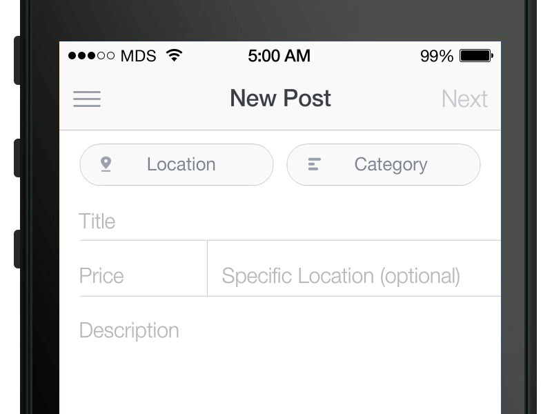
User experience in workflow software directly affects adoption and completion rates. Here’s how we approach workflow management.
Workflow Made Easy
The real problem we were solving
The UI piece is really just about shininess for buttons. Rounded corners, consistent spacing, no longer all caps. Standard stuff.
But as I wrote in that original thread:
The UI piece is really just about shininess for buttons while the UX piece is about making it feel like you’re being reacted to a lot more than the minimal work you’re doing, amplifying satisfaction.
Read that again. Users do minimal work - they click a button. But the feedback should feel substantial. Not because it adds functionality. Because uncertainty is psychologically uncomfortable. When we tap on a button, we instinctively expect a response. The tiny flash of animation or color change reassures us: “you’ve been heard.”
Without that confirmation, doubt creeps in. Did it work? Should I click again? Is this thing broken?
Pre-click versus post-click
We identified two distinct moments that needed attention:
Pre-click hover (desktop): A spreading-shadow thing may be possible pre-click on hovering on a button with a mouse on desktop. Something that says “yes, this is clickable, and I’m ready to respond.”
Post-click animated movements: For a click to feel satisfying, there should be some animated movement after the click. A shadow spreading away. A color state change. Something that makes you feel like you did more work than you really did.
Thomas got excited about this immediately. He posted a video demo and wrote:
I had something similar I’ve been meaning to post. In regards to actual styles I’ll update this thread this week with some ideas.
I asked whether this could apply beyond just buttons:
Could this sort of post-click splash apply to any field, not just buttons? I’m wondering that AFTER a capture box is filled out and saved (not just clicked on) - the splash might sort of “confirm save”?
Thomas saw the bigger picture:
In addition to buttons there are tons of areas I’m looking to add delight with smoother animations, how things popup, close etc.
This is where Matias Duarte’s Material Design team got it spot on with the ripple effect. Users touch a specific spot, and the visual feedback originates from that exact point. The expanding circle creates anticipation and confirms the action was registered.
Thomas referenced Material Design’s button implementation as inspiration: “Something like material designs click? Maybe faster though.”
Though as we debated internally, the ripple that always starts from the center of the button, instead of the point of contact - that’s not the most natural feedback.
Watch how clicking on any given field glows quickly and then fades out.
I added this observation in a later comment:
I also think that every click in the app could do a micro-ding so that it feels super-fun to use. Watch how clicking on any given field above glows quickly and then out.
The satisfaction is in these tiny things - on every click.
The micro-ding concept
This became a running thread in our discussions. Beyond visual feedback, could we add audio confirmation?
As I wrote in one of the threads:
I also think that every click in the app could do a micro-ding so that it feels super-fun to use.
The idea was simple: imagine this one tiny micro-explosion on every click or touch you do. Not overwhelming. Not annoying. Just a small confirmation that the system heard you.
Thomas agreed: “These micro-interactions are what make the app feel polished.”
We ultimately decided this was a separate concern from button styling. One thing that keeps coming up when we talk about interaction design is the tension between “make everything feel alive” and “don’t overwhelm people.” I clarified:
Although note that I think there are two separate things here: 1. The buttons having polish and animation pre-click and post-click. 2. Any click at all having a little ding.
The debate about button hierarchy
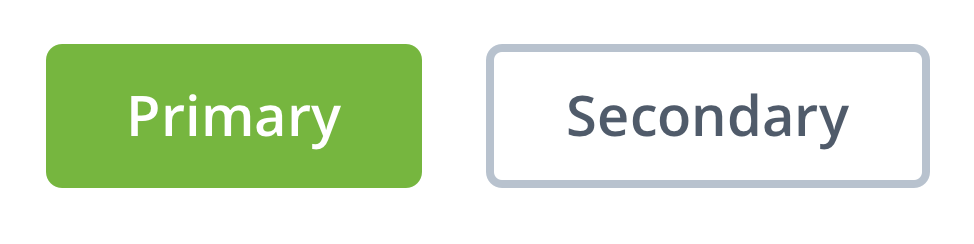
Thomas proposed something that sparked debate: primary buttons in solid color, secondary buttons as ghost outlines. His goals for the task were clear:
Decide on a new button style for V2. Rounded with more space, no longer all caps, a few different styles. You will always need a primary and secondary style. A third, more generic style is good to have for actions that are less important but still need button style affordance.
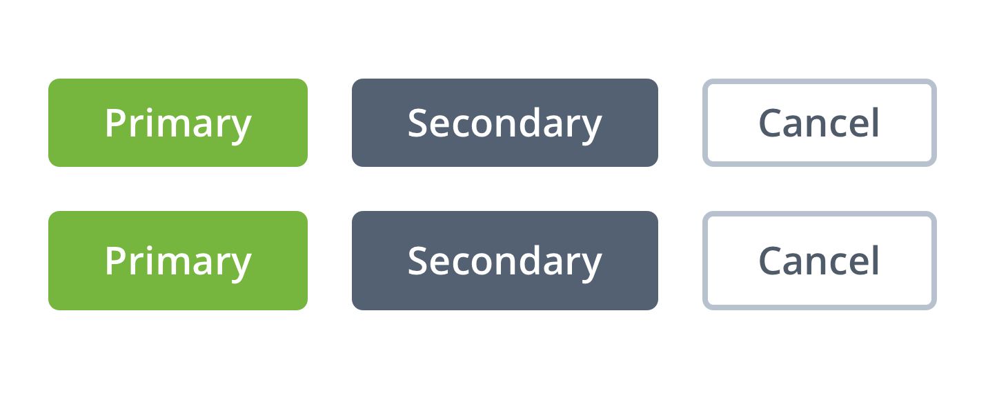
Thomas’s initial proposal: rounded, more space, no longer all caps, with distinct styles for primary, secondary, and general actions.
Pravina, our product manager, pushed back immediately:
I’m not sure about the use of grey for secondary and general buttons. Imo, grey really stands out against white, and is a pretty glum color, it makes me feel serious.
She suggested using brighter colors from our palette - perhaps green or orange for secondary buttons.
Thomas had a thoughtful response that shaped our final approach:
I think the goal of the non-primary buttons is to make the primary action stand out more. We don’t want it to feel too serious but we also don’t want any confusion as to what you should probably click.
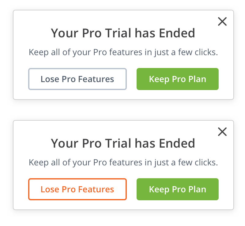
Look at the top example: it’s obvious what path we’re suggesting you should take by coupling the green button with a less in-your-face gray ghost button. The bottom example shows what happens when both options compete for attention - the decision becomes less obvious.
The psychology here is real. Research on micro-interactions confirms that when users see clear visual hierarchy, they complete tasks faster and with less cognitive load. When everything demands attention, nothing gets it.
Pravina eventually came around:
I now see and agree with this. I think the goal of the non-primary buttons is to make the primary action stand out more.
The ripple effect reversal
Here’s where things got interesting. We implemented something, shipped it, and then un-shipped it.
In an internal ticket about adding ripple feedback effects to button clicks, someone requested “Feedback loop (ripple) on clicking any button.” We built it. A CSS-based solution that created ripple effects on button clicks. The implementation seemed elegant. As the PR noted:
This is purely a CSS based solution, and doesn’t affect the code/functionality in any way.
Then came another ticket about mouse click ripple effects for desktop. We expanded the ripple to trigger on any mouse click anywhere in the app. It seemed like the logical extension of our “micro-explosion on every click” philosophy.
Turns out, we removed it. The feedback was decisive:
A bit unexpected and distracting.
What worked beautifully for buttons became annoying when applied universally. Users clicking on text, clicking to select fields, clicking to dismiss modals - they didn’t want a ripple following their every move. The feedback felt more like being watched than being heard.
This was a crucial lesson. The goal was never “ripples everywhere.” The goal was making users feel like the software was responding to them. Though that’s an oversimplification. For buttons - yes. For every surface in the app - no.
Stateful versus stateless
Thomas introduced another distinction I hadn’t considered:
Buttons which save, complete a task, skip etc. can contain loading indicators and change states. This will make the app feel a bit quicker as well. Other buttons may be stateless and have different animations.
He elaborated on the loading approach:
The idea is that keeping the loading animation contained within the UI the user is interacting with will be less jarring and seem smoother/faster.
Think about a “Save” button. It should:
- Respond to hover (pre-click)
- Show a loading state while saving
- Transform to “Saved” with a satisfying animation
- Watch if anything else has changed so that the green “Save” button comes back to save your little changes again
That last point came from our internal discussion. As I noted:
I should also mention that technically speaking, when you go into “Saved” state, we need to watch if anything else has changed so that the green “Save” button comes back to save your little changes again - i.e. it can’t just stay in gray “Saved” state if you then make changes.
The button needs to wake back up.
The sound question
We even explored audio feedback. Jason Fried’s Basecamp uses a super-mario sound when you click on “Clap.” Is this something we can or should do? If so, after which precise user events would we emit a sound?
Thomas experimented with sounds for completing a task: “Goal is to create a satisfying connection with clicking Complete. If a user clicked RE-OPEN it might play backwards or something.”
We ultimately decided: “A nice MVP would be just one sound in one area of the app, accompanied maybe with a toggle in settings for anyone who doesn’t want it.”
This is important. Not everyone wants audio feedback. But for those who do, sound and animation feedback raises reported satisfaction by 30% - that’s a number worth paying attention to. Does that mean every app needs sound? No.
Progress bars and motivation
Related to this work, we also explored adding a progress bar to encourage step completion. The question: do progress bars motivate people to continue, or frustrate them?
In another discussion about redesigning the completed task view for better achievement feedback, someone raised that completed tasks look “dull” - lacking the celebration and achievement feeling they deserved. This connected directly to our button work. Every completed action deserved acknowledgment.
The connection to workflow design
Why does this matter for workflow software specifically?
After watching hundreds of teams try this, we’ve seen a pattern that’s hard to ignore. One payroll processing firm told us they’d reduced client onboarding from 14 days to 5 days - a 64% improvement. Impressive on paper, painful in practice. But the daily experience of using the software still felt like a grind. The efficiency gains were real, but user engagement remained flat. Their team would complete tasks faster, then immediately close the app. No exploration. No organic adoption of new features. People complete tasks all day - click, click, click - and if each click feels dead, the software becomes a chore. When you complete a task in Asana, a small checkmark slides across the screen - sometimes with a unicorn that flies by. While Asana has its limitations as a workflow tool, their investment in micro-interactions is worth studying. That moment of visual feedback is B.F. Skinner’s behavioral psychology in action - positive reinforcement that rewards behavior and encourages repeating that action. For Tallyfy, we wanted the same thing. Every task completion should feel like a small victory, every process launched should feel like momentum - the micro-interactions are real psychological tools that satisfy user needs for feedback, emotion, and predictability.
You can see how we approach these details in our tutorials.
What we learned
At Tallyfy, after months of iteration, we landed on these principles:
-
Every clickable element needs three states: default, hover, and active. Most teams nail default and forget the rest.
-
Post-click feedback should be proportional to action importance. A task completion gets more celebration than a settings toggle.
-
Primary actions should be visually obvious. Use color, contrast, and animation to guide users toward the intended path without forcing them.
-
Stateful buttons require careful attention to state transitions. Save to Saved to Save-again is a common pattern that most implementations botch.
-
Audio is powerful but optional. Always provide a way to turn it off.
-
Universal effects can backfire. Just because something works for buttons doesn’t mean it works everywhere.
What we left out
We didn’t ship everything we discussed. Some ideas stayed on the cutting room floor:
-
Confetti on process completion: Thomas suggested “confetti after a process is completed, or a gif of someone celebrating.” We decided confetti seems overdone. Though I later said “Second thoughts - confetti sounds fine!” - we still haven’t added it.
-
Raptorize: I found an old jQuery plugin called Raptorize that makes a raptor run across the screen with a sound effect. Tempting. Unprofessional. Still tempting.
-
Sound on every action: We scoped down to just task completion because sound everywhere would be overwhelming.
-
Universal ripple effects: As mentioned, we tried it and removed it based on user feedback.
-
The micro-ding: Despite my enthusiasm for audio feedback on every click, we never shipped it. The concern about overwhelming users proved valid.
The hardest part of interaction design is knowing when to stop. Not every click needs a celebration. Not every action needs a sound. The skill is in choosing which moments deserve emphasis - and honestly, that’s harder than it sounds.
How this applies to your products
If you’re building anything users interact with repeatedly:
-
Audit your button states. Load your app, hover over every button, click every button. Does anything feel dead?
-
Time your feedback. Jakob Nielsen’s research suggests feedback should begin within 100ms of interaction. Longer delays break the illusion of direct manipulation.
-
Watch real users. Do they click buttons twice? That’s a sign your feedback isn’t confirming their action registered.
-
Respect reduced motion preferences. Some users have vestibular disorders or simply prefer calmer interfaces. Modern CSS lets you detect this preference and adjust accordingly.
-
Test universal effects carefully. What feels delightful for one interaction may feel annoying when repeated hundreds of times.
The goal isn’t to make software flashy. The goal is to make software that feels alive - that responds to users like a conversation rather than a monologue.
Every click is a question. Your interface should answer it.
About the Author
Amit is the CEO of Tallyfy. He is a workflow expert and specializes in process automation and the next generation of business process management in the post-flowchart age. He has decades of consulting experience in task and workflow automation, continuous improvement (all the flavors) and AI-driven workflows for small and large companies. Amit did a Computer Science degree at the University of Bath and moved from the UK to St. Louis, MO in 2014. He loves watching American robins and their nesting behaviors!
Follow Amit on his website, LinkedIn, Facebook, Reddit, X (Twitter) or YouTube.

Automate your workflows with Tallyfy
Stop chasing status updates. Track and automate your processes in one place.