Conditional visibility that does not break your workflow
The internal design debates on showing and hiding workflow steps dynamically. Why step-level rules beat process-level rules, and how to visualize conditionals without becoming a flowchart tool.
Summary
- Rules only fire once, by design - This is the most misunderstood aspect of our conditional system. Once triggered, automation rules cannot be triggered again in the same process run. Intentional.
- Users think “hide or show” not “visibility action” - We learned this the hard way. Our original terminology confused people. They naturally think in verbs: hide, show, skip. Not abstract concepts.
- Three dimensions matter: What, Who, When - A workflow isn’t just steps. It has owners and deadlines. Most tools only visualize one dimension. We had to show all three on a phone screen.
- Color coding prevents confusion - Green means no automations. Orange means visibility automation on the step. Red means visibility automation on a field. This signal system emerged from real support tickets.
Conditional step visibility - this is our personal, candid experience building one of the most powerful and most misunderstood features in Tallyfy. This reflects our experience at a specific point in time. Some details may have evolved since, and we’ve omitted certain private aspects that made the story equally interesting. What follows is our internal design history, drawn from Basecamp discussions, GitHub issues, and the hand-drawn sketches that shaped everything.
The feedback that pushed us to build this came from venture capital firms running due diligence workflows and operations consultants managing recurring client processes. They needed different paths based on deal type, property type, or client tier - not a single rigid sequence. Their processes weren’t linear. Why was our software forcing them to pretend otherwise?
Conditional logic is essential to workflow automation. Here’s how we approach it.
Workflow Automation Software Made Easy & Simple
October 25, 2016 - the customer complaints that started it
The first redesign conversation started with customer feedback, posted to our internal design board:
“Recent feedback from customers regarding the current builder:
- Conditionals is hard to find
- Conditionals should be at step level (not whole process level)
- Conditionals should be simpler to set up - give dropdown options as we expand on the types of logic we can offer”
Three complaints. Three design problems. And I knew we had to address all of them together, not separately.
Our CTO responded the same day:
“Agreed. I’ve been wanting to move conditionals to the step level. It will require a rewrite on the API. And then we’ll implement in the new Angular client UI.”
A rewrite. Not a patch. Moving conditionals from process-level to step-level was an architectural decision that would touch every layer of our system. This wasn’t a cosmetic change.
Survey Gizmo as unexpected inspiration
In that same thread, a team member shared reference research:
“I looked at Survey Gizmo’s ‘Logic’ feature that they have it at step level and wanted to share it as inspiration for when we build out the new UI for the builder and conditionals.”
We studied how survey tools handle conditional logic. Skip questions based on answers. Show follow-up fields based on selections. The patterns were similar to workflow branching - but survey logic is fundamentally simpler than process logic.
Surveys are linear with branches. Workflows have dependencies, parallel paths, and completion states that interact. We could learn from survey tools, but we couldn’t copy them directly.
April 18, 2017 - the visual process sketch
Six months later, I posted a fundamental question to the team:
“Customers are thinking about processes visually, they always have. Given our strength is conditional branching - we need to come up with a view in builder that lets someone visualize the entire process flow - without actually doing flowcharts.”
That last phrase mattered most: without actually doing flowcharts.
I added:
“We never want to actually get into full-on flowcharts.”
This was a product decision, not a technical limitation. Flowcharts are a rabbit hole. Once you start drawing boxes and arrows, you become Visio. That wasn’t our direction.
In 99% of cases it’s a solution in search of a problem, peddled by an expensive consultant.
For our philosophy on if-this-then-that rules replacing flowcharts, the documentation explains the thinking.
I attached a hand-drawn sketch:
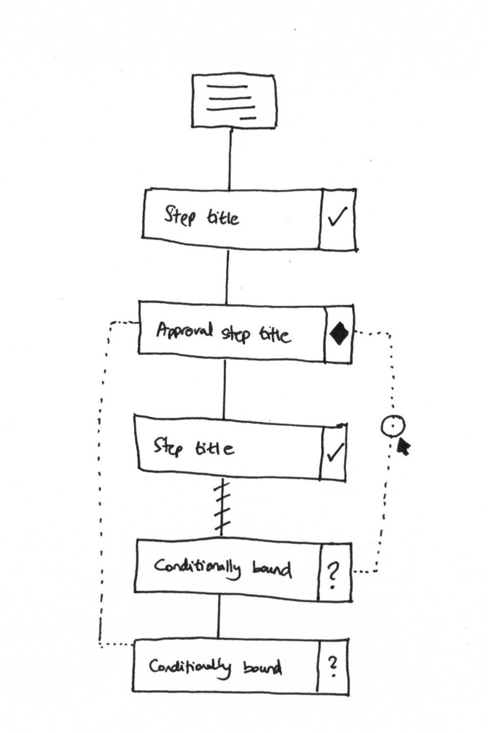 The original visual process sketch, April 2017. Dotted lines indicate conditional paths. Question marks mark conditionally bound steps.
The design principles in that sketch:
“The form icon at the top means this process starts with/has pre-run captures (whatever we end up calling them).”
“We only show step title and icons against the steps to represent types e.g. approval steps would be diamond icons to keep this familiar with BPMN/UML that the professional world knows/uses.”
“When steps are ‘conditionally bound’ i.e. a condition affects them - they have a certain icon and are joined by a dotted line either side. Clicking or touching the line opens up the specific IFTTT condition which you can edit.”
The broken line metaphor
I spent time explaining why the dotted line pattern was important:
“The broken line indicates the next step may not always happen.”
This was deliberate. A solid line means “definitely comes next”. A broken/dotted line means “might come next, depending on conditions”. Users could glance at a workflow and immediately understand which parts were fixed and which were dynamic.
For multiple conditionals:
“If a conditional affects multiple steps (e.g. anything tagged with X) - we could show a dotted line on the same horizontal plane extending all the way down to link with all affected steps.”
“Every conditional rule should trigger a new dotted line equally spaced left or right (wherever is least congested) - and distanced from the previous dotted line horizontally - almost like runways at an airport.”
“Like runways at an airport” - I still think that’s the right mental model. Parallel paths, visually distinct, clearly separated.
The mobile-first constraint
I was very specific about layout:
“Note that the steps are always shown linearly/vertically - we never scroll or lay them out horizontally - making it okay for phones, hopefully.”
Horizontal scroll kills mobile usability. And once you allow horizontal layout, you’re one step away from becoming Visio. That wasn’t our product direction.
“I presume you can toggle in builder between card view and flow view, or something. This is for future iterations, and crosses the bridge between full-blown flowchart and primitive checklist.”
The goal: more sophisticated than a checklist, simpler than a flowchart. That middle ground took years to find. Our conditional logic documentation reflects where we landed.
The missing dimensions problem
Within hours, a team member pushed back with a critical observation:
“The above view shows just 1 element of a workflow: A. What needs to be done - Our Basics/Captures and Conditional Branching
It is missing: B. Who needs to do it - Owners C. When is needs to be done - Deadlines”
She included a reference image showing how traditional tools handle this - swimlanes for owners, timelines for deadlines:
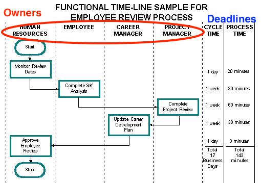 Traditional swim lane approach: Owners in columns, deadlines in a timeline. Thorough but complex.
Then she proposed a solution:
“We will need to incorporate all 3 elements into a mobile-friendly view.”
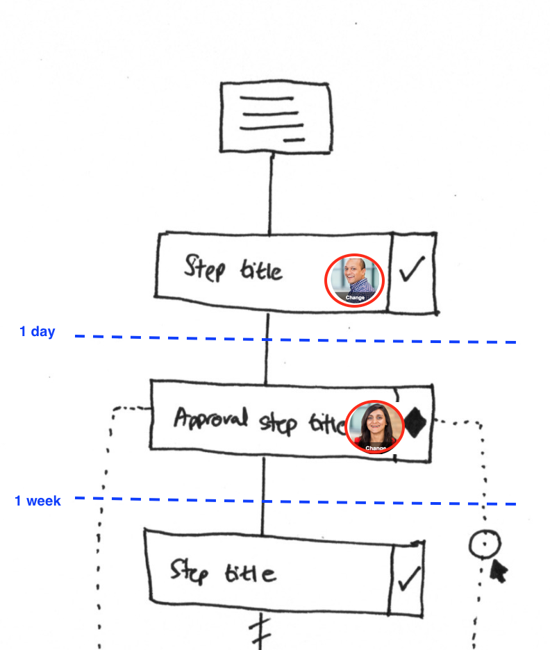 The three-dimensional view: What (steps), Who (avatars), When (deadline markers). April 2017.
This sketch showed the synthesis:
- Steps shown vertically (the What)
- Owner avatars embedded in each step card (the Who)
- Blue dashed horizontal lines marking deadline transitions - “1 day”, “1 week” (the When)
- Conditional dotted lines connecting steps that might be skipped (branching)
One view. All three dimensions. Still mobile-friendly.
The “rules only fire once” decision
This is probably the most misunderstood aspect of our conditional system. From a GitHub discussion in 2019:
“All rules only fire once, once triggered, they cannot be triggered again.”
This was intentional. Not a bug. Not a limitation we couldn’t fix.
We learned this the hard way from a property management company with 400+ active daily workflows across their operations. When they first tested our conditional rules, they expected spreadsheet behavior - change a field value, and all downstream logic recalculates. In practice, this created chaos. Steps would appear and disappear mid-process, confusing everyone involved.
Why? Because workflows aren’t spreadsheets. A spreadsheet recalculates every time any cell changes. That makes sense for formulas. It doesn’t make sense for processes.
Imagine this scenario: Step 3 is hidden because a form field was “No”. Someone completes step 4. Then someone goes back and changes the form to “Yes”. Should step 3 suddenly appear between completed steps? Should it interrupt someone in the middle of step 5?
The answer is no. Rules fire once. When the condition is first evaluated, the decision is made. The workflow proceeds from there.
Teams tell us the same thing in different words this confuse users who expected spreadsheet behavior. But it protected them from chaos.
Templates using conditional visibility
These workflows route to different approvers based on field values - exactly the pattern described above
The terminology problem
An internal discussion about redesigning the automation creation UI captured something we learned the hard way:
“Users don’t understand terms like ‘Visibility action’. Users naturally think ‘Hide or show a step’.”
We were using abstract technical terminology. Users wanted verbs. Hide. Show. Skip. Not “visibility action”. Not “conditional branch”. Just tell me what happens.
This shaped everything about our UI copy. The feature does the same thing. The words changed entirely.
The edge case that broke our brains
Years later, someone asked in a GitHub issue:
“What if that step is completed, will they still execute?”
Wait. What happens if a visibility rule tries to hide a step that someone already finished? The rule fires. The step should be hidden. But it’s done. Complete. People worked on it.
Do we hide it and pretend it never happened? Do we show it greyed out? Do we ignore the rule entirely?
We decided: completed steps can’t be hidden. The rule fires, but completed work is never invisible. You can see what happened. You just can’t undo it through automation.
The color-coded signal system
Support tickets revealed a pattern. People set up visibility automations and forgot about them. Then they wondered why steps appeared or disappeared “randomly”.
The solution was visual:
“Green - No automations. Orange - Visibility automation on Step. Red - Visibility automation on Field.”
Before you even test a workflow, you can see which steps have conditional logic attached. Orange steps might disappear. Red fields might become required or hidden. Green steps are static.
This isn’t in any competitor. We built it because we needed it.
 Color-coded visibility indicators: Users can see at a glance which steps have conditional logic before testing.
The IS EMPTY problem
In August 2019, we hit an edge case that exposed deeper complexity:
“If Kick-off form is empty, then hide/show - Tasks that should be hidden or shown when a KO is empty are not being hidden/shown.”
Empty state handling. When does “empty” mean “not filled in yet” versus “intentionally left blank” versus “doesn’t apply to this workflow instance”?
The IS EMPTY condition sounds simple. It revealed how conditional logic interacts with workflow state in unexpected ways. An empty field at process start is different from an empty field that was cleared later. Both return “empty” but the workflow implications differ.
How this connects to Sherlock
The Sherlock rules engine provides the foundation for conditional logic as reusable rules - the “if this then that” framework. Conditional visibility is where that framework gets applied.
The rule types for visibility are straightforward:
- If (form-text-box) value is (a number) AND “>4500” then hide this step.
- If (form-text-box) value is “Nashville” then re-assign task (select another task) to (set of people)
The first rule is pure visibility control - hide a step based on a value. The second shows how visibility rules chain with assignment rules. A single condition can trigger multiple actions.
The Sherlock test interface matters here too. Before deploying a visibility rule:
“After you build a rule, you need to test it. i.e. try an input … see the result Sherlock would give you …”
If your rule hides steps incorrectly, you want to discover that in testing, not when a real workflow runs and someone can’t find the step they need.
The GitHub issue trail
Our issue tracker tells the story of iteration. Some representative issues:
Fixing a bug where sound settings weren’t being respected
“Implement a new automated action in the API that enables conditional field requirements. This action would allow:
- If a specific field has a certain value, then set another field as required (Y/N)
- This logic should work within the same step
- Dynamic field validation based on user input”
Conditional visibility isn’t just hiding steps. It extends to fields within steps. Conditional required states. Fields that become mandatory based on what you answered elsewhere.
Optimizing task card loading with parallel API calls
“Need ability to reverse/undo specific rule executions within a task through a user interface toggle.”
What happens when a rule fires but the user wants to undo it? Manual override of automated visibility. We debated whether this belonged in the product at all.
Adding BETA labels to experimental features
“Users need to test processes and automation rules without launching actual processes that clutter their tracker.”
The testing problem again. Before Sherlock had a test interface, users would launch real workflows just to see if their conditional rules worked. The tracker filled with test runs. Drive-thru processes solved this - test environments that auto-archive.
The debate on complexity
Our internal discussions returned to the same tension repeatedly:
“Activation only shows up for first-time access to a more advanced feature that you already have in your plan. It’s designed to both hide complexity as well as measure intent for advanced features.”
Conditional visibility is powerful. Powerful enough to confuse people who don’t need it. We considered gating it - not behind a paywall, but behind an “activation” click that says “yes, I want this complexity”.
“This power-up is free. You just need to activate it.”
The language borrowed from Trello’s power-ups model. We never shipped feature activation for conditionals, but the debate shaped how we document and onboard users. The pattern we keep running into is that power features need progressive disclosure - showing complexity only when someone’s ready for it.
What we left out
There are implementation details that remain internal. How we handle circular references - rules that reference each other in ways that could loop forever. How the execution order works when multiple visibility rules fire simultaneously. Edge cases where hiding a step would orphan dependent steps.
These are solvable problems. They’re also the kind of details that matter enormously during implementation and barely matter when explaining design philosophy.
The distance traveled
From “Conditionals is hard to find” in 2016 to step-level conditional visibility with owner assignment, deadline tracking, and visual branching indicators. From process-level rules to step-level rules. From hiding steps to conditionally setting field requirements. Each iteration came from real feedback. Each architectural change required coordinating API rewrites with client UI work. Each visual design decision balanced comprehensiveness against mobile usability. The dotted lines still connect conditional steps. The broken line still means “might not happen”. The vertical layout still works on phones. We never became a flowchart tool. That was always the point.
About the Author
Amit is the CEO of Tallyfy. He is a workflow expert and specializes in process automation and the next generation of business process management in the post-flowchart age. He has decades of consulting experience in task and workflow automation, continuous improvement (all the flavors) and AI-driven workflows for small and large companies. Amit did a Computer Science degree at the University of Bath and moved from the UK to St. Louis, MO in 2014. He loves watching American robins and their nesting behaviors!
Follow Amit on his website, LinkedIn, Facebook, Reddit, X (Twitter) or YouTube.

Automate your workflows with Tallyfy
Stop chasing status updates. Track and automate your processes in one place.