The single Create button that changed everything
In October 2017, Tallyfy designer Thomas sketched a three-option Create button on a whiteboard. Why a single prominent action beats scattered options, and how color and hierarchy drive user behavior.
Summary
- A single prominent Create button beats scattered options - the goal of non-primary buttons is to make the primary action stand out more
- Empty states create helplessness - without clear guidance on what to do next, users feel lost in your product
- The Push vs Pull model defines stickiness - push model means “I have to go to it” (sad face), pull model means “It makes me come in” (happy face)
- Color creates visual hierarchy - green for primary actions, gray ghost buttons for secondary, making the path obvious
- Quick creation wins - “name it and hit ENTER” beats elaborate wizards every time
There’s a moment in every product design discussion where someone asks the wrong question. They ask what features to add. The right question is simpler: what single action do we want users to take?
For workflow software, that action is creation. Not viewing. Not reporting. Creating.
Template creation is the foundation of workflow management. Here’s how we approach it.
Workflow Made Easy
This is our candid experience building the Create button at Tallyfy. It reflects our experience at a specific point in time. Some details may have evolved since, and we’ve omitted certain private aspects that made the story equally interesting.
We saw this pattern clearly with an estate law firm that went from managing hundreds of cases in Excel spreadsheets to using structured workflows. They doubled their attorney productivity - each lawyer now handles twice the industry average caseload. But the breakthrough came from one simple realization: attorneys stopped memorizing 100+ process steps and started just creating processes from templates. The creation action unlocked everything else.
The whiteboard that started it all
In October 2017, we stood around a whiteboard sketching what would become a fundamental decision. The question we wrote at the top: “John, what shall we create?”
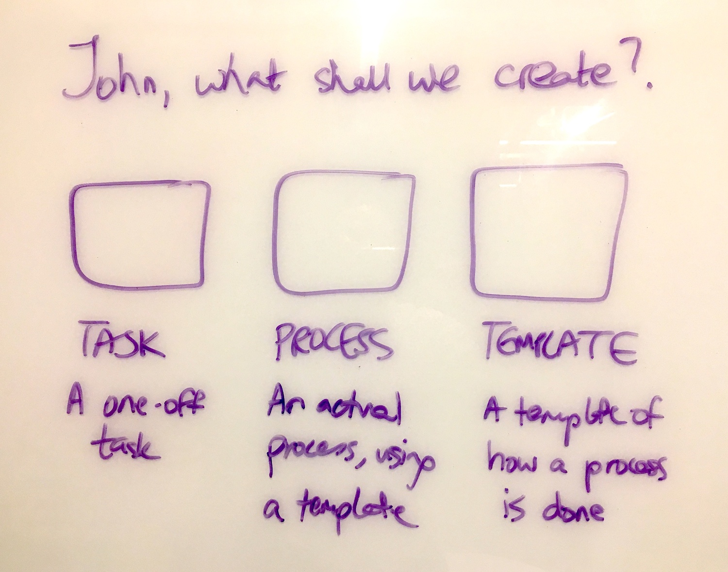
Three options. Not twelve. Not a menu inside a menu inside a dropdown. Three.
This sketch captures something we debated for months: the relationship between complexity and action. Turns out, the more options you present, the less likely someone is to choose any of them. The pattern we keep running into is that simplicity drives action, and complexity drives paralysis.
Years later, we still wrestled with this. A GitHub issue from a prospect revealed the ongoing challenge:
“I suspect our array of links in different places is the issue - we have create at the bottom then create folder at the top.”
The prospect didn’t know how to create a subfolder. Not because the feature was missing, but because our clunky “array of links in different places” obscured the path. The template creation experience should never leave users guessing.
Why button hierarchy matters
Our designer Thomas put it plainly in August 2017:
“I think the goal of the non-primary buttons is to make the primary action stand out more. We do not want it to feel too serious but we also do not want any confusion as to what you should probably click.”
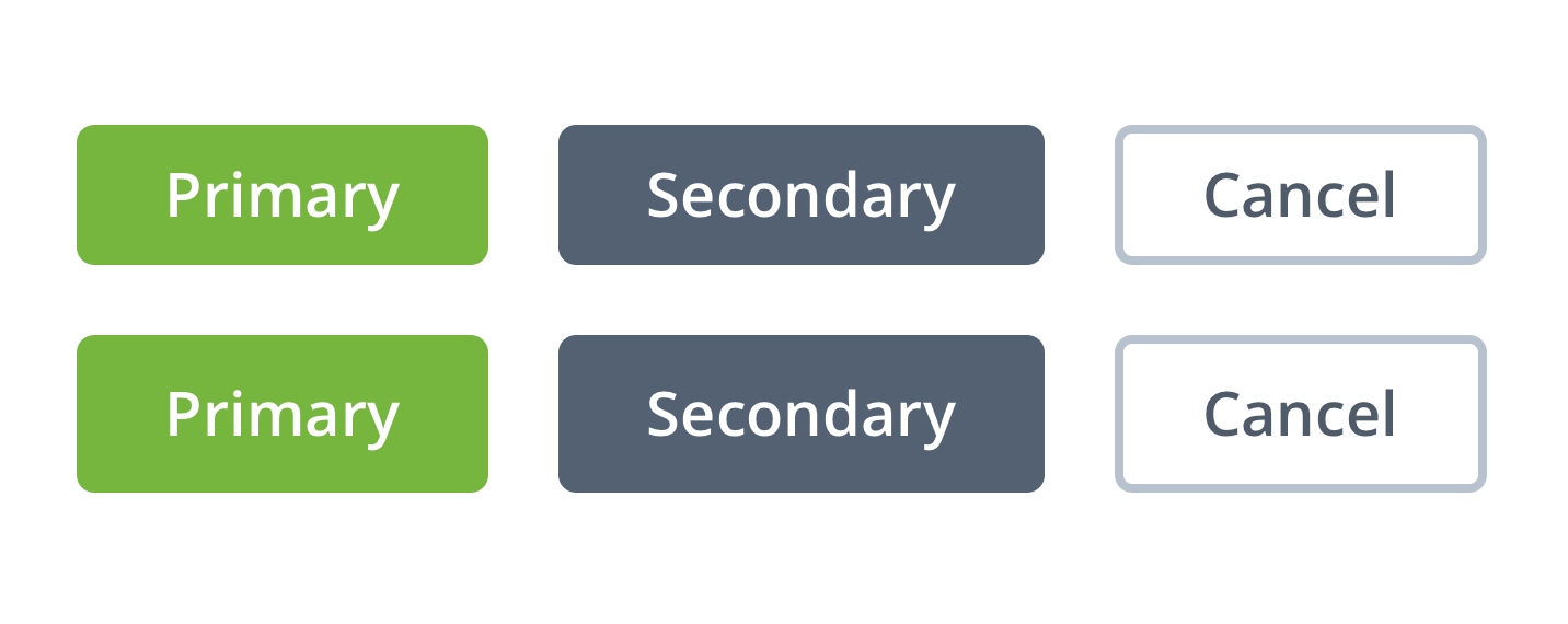
He attached an example showing how the green button paired with a gray ghost button makes the decision obvious. Then another example where equal visual weight creates confusion.

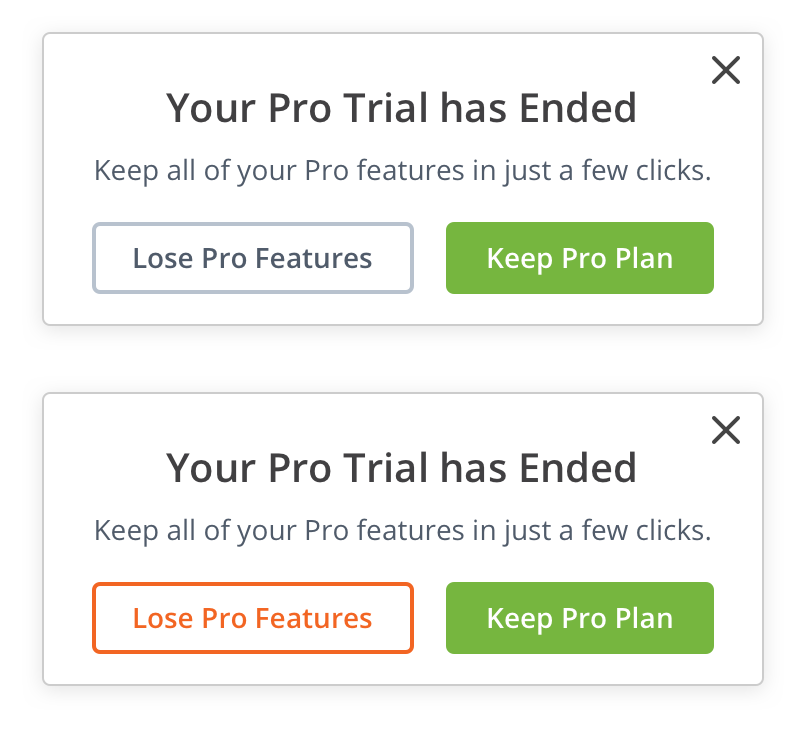
Pravina pushed back on the gray secondary buttons:
“I am not sure about the use of grey for secondary and general buttons. Grey really stands out against white, and is a pretty glum color, it makes me feel serious. I would like to suggest using brighter colors from our palette, perhaps, green or orange.”
Thomas responded with the core principle:
“We don’t want it to feel too serious but we also don’t want any confusion as to what you should probably click. I attached an example below where it is obvious what path we are suggesting you should take by coupling the green button with a less in your face gray ghost button.”
The debate wasn’t about aesthetics. It was about psychology. What does the user see first? What does the button tell them to do?
The empty state problem
In November 2017, I posted about what happens when users land on an empty screen:
“We should really roll out an empty-state graphic for now when there is no tasks in My tasks, no templates in Templates Library. If this is easy to pop into 2.0 it would prevent a lot of user helplessness on what to do next.”
User helplessness. That phrase captures what most SaaS products get wrong. They build features and forget that features without direction create paralysis. I learned this the hard way at Tallyfy. You can have the best feature set in the world, but if users can’t figure out what to do first, none of it matters.
A B2B podcast production company we worked with had a 60-task workflow for each episode. When new team members joined, they would stare at an empty dashboard with no idea where to start. The Create button was there, but it competed with five other navigation options. Their onboarding time for new producers was measured in weeks, not days.
I noted the difference between empty states and onboarding:
“Note that empty-state design/visual is not the same as onboarding. Onboarding is just for first-time experience.”
Empty states happen every time. First login. After completing all tasks. After archiving templates. Each moment is an opportunity to guide action or create confusion.
We eventually formalized creation as a progress milestone. In our user journey tracking, we defined:
“U2: Create a template - any template created”
The moment of first creation became a measurable checkpoint. Before U2, users were exploring. After U2, they were invested.
The push vs pull model
By December 2018, we’d learned something important. Getting users into the product wasn’t the hard part. Getting them to bring others was. I sketched this on a whiteboard:
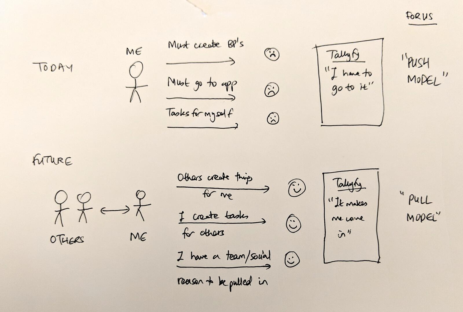
The Push Model showed a single person: “ME” with arrows pointing to actions like “Must create BPs,” “Must go to app,” “Tasks for myself.” Each arrow ended with a sad face. The product experience was: “I have to go to it.”
The Pull Model showed two stick figures: “OTHERS” and “ME” with bidirectional arrows. “Others create things for me.” “I create tasks for others.” “I have a team/social reason to be pulled in.” Happy faces. The product experience became: “It makes me come in.” This sketch changed how we thought about the Create button. Actually, that oversimplifies it. It wasn’t just about making things. It was about creating reasons for others to join.
The stickiness insight
I wrote:
“I think we need to use the +NEW button as a new way to draw in others rather than focus on just individual actions like Create Task.”
We kept bumping into the same truth. Creation is inherently social in workflow software. When you create a task, you assign it to someone. When you launch a process, others participate. The Create button isn’t just about making things. It’s about pulling people in.
I proposed expanding what NEW could mean:
“Imagine these NEW buttons existed: New Task (exists). New Request for Help. New Request for Information. New Approval Request. In 2, 3, and 4 - it has to be to someone else, building systems that pull others in to create a reason/draw for inviting coworkers.”
This was the core stickiness lever. Every creation that involved someone else was a notification, a reason to return, a hook.
The GitHub moment of truth
Pravina challenged this immediately with a real-world example:
“I think we are expecting a lot from the user here. We are asking them to think about what their task is before they even type it. Today in Github, I click NEW ISSUE. If GH asked me to then decide: Ask question, Report Bug, Request enhancement, I may not know that it is either one of these yet. I would rather tag these up later.”
She was spot on. We were overcomplicating it. The friction of categorization before creation killed momentum.
I responded:
“Maybe just tagging a task e.g. #question etc. fully serves all use cases. I agree that explicitly asking for task type is not a great UX.”
Thomas added the speed requirement:
“name it and hit ENTER”
That became the standard, a no-brainer. Creation should be instant. Categorization comes after. The user types, presses Enter, and the thing exists. Any friction before that moment is a failure.
Creation as an integral action
We later recognized that template creation needed more prominence. A GitHub issue noted:
“Given that this is an integral action for users”
The proposal was to expand the Create Template wizard to fullscreen mode. When something is truly important, when it’s the core action that defines your product, it honestly deserves the full screen. Not a modal. Not a sidebar. The whole canvas.
This was the evolution from “button” to “experience.” The Create button opens the door. What happens after determines whether users stay.
The three-step sketch
We had another whiteboard moment that captured the ideal user journey:
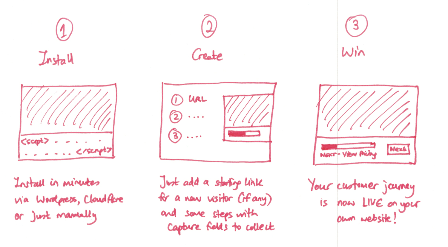
Install. Create. Win.
Not install, configure, customize, integrate, train, deploy, iterate, measure, optimize. Three steps. The Create step sits in the middle because that’s when the product becomes real. Before creation, you’re just looking at software. After creation, you’re using it.
What we left out
The debates about button design included many ideas we chose not to build:
Post-click animations: I suggested copying Jason Fried’s Basecamp button animations: “something similar to basecamp. On the post-click UX, I had in mind something similar.” Thomas noted this wasn’t priority for the core product launch.
Spreading shadow effects: We discussed pre-click hover effects and “satisfying” post-click animations. Thomas said: “In addition to buttons there are tons of areas I am looking to add delight with smoother animations, how things popup, close etc. Since it is not priority #1 for V2 I am just noting them for now.”
Multiple task types in the dropdown: The idea of Request for Help, Request for Information, and Approval Request buttons got rejected after Pravina’s GitHub critique. Too much cognitive load before the user even starts typing.
Tag suggestions before creation: We considered prompting users to tag tasks during creation (“To group lots of the same types of tasks - use tags like #question #help #approval”) but ultimately let them tag afterward.
Forced categorization: The original proposal had users choose task type before writing. Pravina killed it: “I would rather tag these up later.” Speed won.
Scattered create locations: The GitHub issue revealed what happens when you compromise: “we have create at the bottom then create folder at the top.” Users get confused. One prominent location beats distributed options.
The hardest part of product design isn’t adding features. It’s removing them while keeping the core action obvious.
The design decision that stuck
What survived all these debates? A single, prominent Create button. Green. Rounded. In the top navigation where users expect to take action.
Thomas summarized the philosophy:
“Below is a proposed idea, rounded with more space, no longer all caps, a few different styles. You will always need a primary and secondary style. A third, more generic style is good to have for actions that are less important but still need button style affordance (like cancel, settings, edit).”
The button hierarchy became: Primary (green, solid), Secondary (gray, solid), Tertiary (ghost outline). Dead simple when you see it laid out.
Green means go. Green means create. Green means the most important thing you can do right now.
Why this matters for your product
Every product has a core action. For social networks, it’s posting. For e-commerce, it’s adding to cart. For workflow software, it’s creating. Does it need to be more complicated than that? No.
The questions to ask:
- What’s the single most important action users should take?
- Is that action visually dominant?
- Do empty states guide users toward that action?
- Does that action naturally involve others (pull model)?
- Can users complete it with minimal friction (name it and hit ENTER)?
The Create button isn’t just a UI element. It’s a growth mechanism. Every template created is a reason for coworkers to join. Every task assigned is a notification pulling someone back.
The push model says: “I have to go to it.” The pull model says: “It makes me come in.”
One button. Prominent. Clear. Designed to pull others in. The rest is details.
About the Author
Amit is the CEO of Tallyfy. He is a workflow expert and specializes in process automation and the next generation of business process management in the post-flowchart age. He has decades of consulting experience in task and workflow automation, continuous improvement (all the flavors) and AI-driven workflows for small and large companies. Amit did a Computer Science degree at the University of Bath and moved from the UK to St. Louis, MO in 2014. He loves watching American robins and their nesting behaviors!
Follow Amit on his website, LinkedIn, Facebook, Reddit, X (Twitter) or YouTube.

Automate your workflows with Tallyfy
Stop chasing status updates. Track and automate your processes in one place.