Why BPMN looked good but did not work for us
Tallyfy rejected BPMN notation in April 2017 after internal debates showed flowcharts fail on mobile devices. The if-this-then-that rule system replaced traditional process notation, and the unreleased Flowtable concept shaped how the product handles process data density.
Summary
BPMN versus if-this-then-that - this is our personal, candid experience at Tallyfy. The debates we had, the prototypes we sketched, and why we deliberately walked away from traditional process notation.
- Flowcharts are impossible on phones - Big diagrams with boxes and arrows simply don’t work on mobile screens. We needed something that scrolls vertically, not sprawls horizontally.
- Users don’t understand BPMN vocabulary - Terms like “visibility action” mean nothing to normal people. They naturally think “hide or show a step” instead.
- Tables beat flowcharts for data density - Our Flowtable concept aimed to show more information in less space: color coding, multiple dimensions, no messy connector lines.
- The bridge problem - We needed something between full-blown flowcharts and primitive checklists. See how conditionals work in Tallyfy
Every workflow tool faces the same architectural question early on. Do you build a flowchart editor? Or do you build something simpler?
BPMN - Business Process Model and Notation, first specified by Stephen White at IBM - is the industry standard. Gateways, events, pools, swimlanes. It looks professional. Enterprise buyers expect it. Consultants are trained in it.
We chose not to build it. This post explains why. This reflects our experience at a specific point in time. Some details may have evolved since, and we’ve omitted certain private aspects that made the story equally interesting.
Our approach to BPM prioritizes simplicity over notation complexity. Here’s how we handle it.
Business Process Management Made Easy
April 2017: The visualization debate begins
I was obsessed with how people think about processes. Back in April 2017, I wrote this to our design team:
“Customers are thinking about processes visually… we need to come up with a view in builder that lets someone visualize the entire process flow - without actually doing flowcharts.”
That last phrase was the key constraint. Visualize without flowcharts. Show the flow without boxes and arrows everywhere.
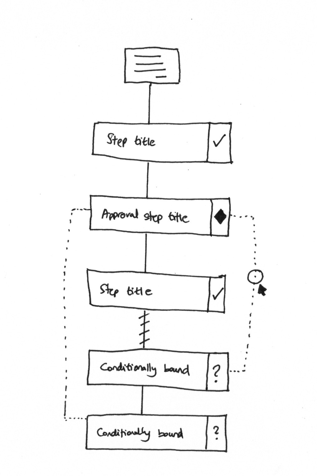
The sketch shows what we were thinking. Steps flow vertically. Diamonds mark approvals. Dotted lines show conditional boundaries. Question marks indicate steps that might not appear.
But I added a critical constraint in the same discussion:
“Note that the steps are always shown linearly/vertically - we never scroll or lay them out horizontally - making it okay for phones. We never want to actually get into full-on flowcharts.”
That decision shaped everything that followed.
The mobile problem nobody talks about
This is where it gets tricky with BPMN diagrams. They sprawl. A typical process with fifteen steps and three decision points becomes a diagram that requires horizontal scrolling, zooming, and panning to understand.
Try viewing that on a phone. It doesn’t work.
From a GitHub issue we logged in 2019:
“Mobile and tablet ready - whereas big flowcharts are impossible to view on phones”
This wasn’t just a nice-to-have concern. We were building workflow software for people who work in the field, in warehouses, on job sites. They don’t have 27-inch monitors. They have phones.
What surprised us when we dug into the data with property management companies, this constraint was especially acute. Their field staff needed to follow maintenance workflows, tenant onboarding processes, and compliance checklists while walking properties - not sitting at desks. One company managing 3,500+ rental units told us their team “relied on memory with no formal tracking” before because their previous tools simply didn’t work on mobile. A vertical, scrollable checklist works anywhere. A sprawling BPMN diagram does not.
A vertical list of steps? That scrolls perfectly on any device. A sprawling BPMN diagram? Useless on mobile.
What swimlanes actually show
Pravina, our product designer, pushed back on my original sketches. She pointed out what I was missing:
“The above view shows just 1 element: What needs to be done. It is missing: Who needs to do it, When it needs to be done.”
She was right. Traditional swimlane diagrams encode three dimensions:
- What happens (the steps)
- Who does it (the swimlane columns)
- When it’s due (the timeline)
My linear sketches only captured the first one.
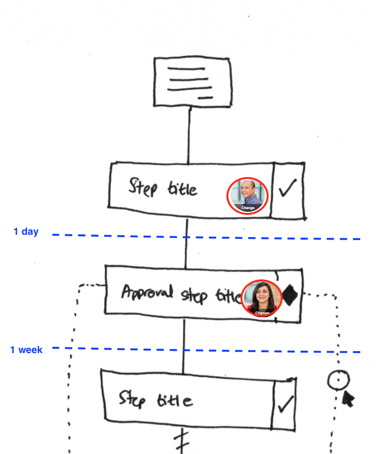
See the difference? Same steps as my original sketch. But now you can see who does each one (the avatar circles) and when (the “1 day” and “1 week” markers).
Pravina added:
“We will need to incorporate all 3 elements into a mobile-friendly view.”
The challenge was encoding swimlane-level information in a vertical, scrollable format. That’s honestly harder than it sounds.
The vocabulary problem
One thing became clear from customer feedback. BPMN terminology confused people.
From an internal discussion about redesigning the automation creation UI:
“Users do not understand terms like ‘Visibility action’. Users naturally think ‘Hide or show a step’”
Mind you, this was a recurring pattern. We would use technical language that made sense to process professionals, and normal users would be lost.
BPMN is full of this. Gateways. Events. Message flows. Pools. Lanes. Artifacts. Each term has a precise meaning in the specification. But when you put a process owner in front of a clunky BPMN editor, they freeze. They know what they want. “If the order is over ten thousand dollars, get manager approval.” They don’t know how to express that in BPMN notation.
This skepticism isn’t just ours. A discussion on r/ExperiencedDevs about BPMN implementations surfaced similar frustrations:
In 99% of cases it’s a solution in search of a problem, peddled by an expensive consultant
At Tallyfy, we decided early on: plain English wins. “If this, then that” beats “exclusive gateway with conditional sequence flow.”
The Flowtable concept
In October 2019, I started an internal discussion about a new Flowtable view as an alternative to flowcharts:
“Flowtables will provide what flowcharts cannot: Intuitive color coding, More than just sequence, No hierarchies or messy lines, Easy to understand for people who do not understand flowcharts”
The concept was a grid. Rows for steps. Columns for different dimensions - who, when, what type. Color coding for status or category.
“Mobile and tablet ready - whereas big flowcharts are impossible to view on phones”
Tables compress information. A flowchart spreads twenty steps across a huge canvas. A table shows the same twenty steps in a compact grid that fits on a screen. Think about spreadsheets. People understand spreadsheets. They don’t understand BPMN. The idea was that you could scan a Flowtable the way you’d scan a project plan - top to bottom, everything visible at once. No panning around a diagram trying to trace connector lines. No squinting at tiny labels inside shapes. The Flowtable never shipped as originally conceived. But the philosophy - data density over visual sprawl - influenced how we built the tracker view.
The bridge we were trying to build
I kept coming back to this phrase in our internal discussions:
“Crosses the bridge between full-blown flowchart and primitive checklist”
That was the positioning problem. On one end, you have enterprise BPM tools with full BPMN support, modeling environments, execution engines. Powerful but complex. On the other end, you have simple checklist apps. Easy to use but no conditional logic, no branching, no automation.
We wanted something in between. Complex enough to handle real business processes. Simple enough that anyone could build one without training.
From a related design discussion:
“We want something ‘in between’ flowcharts and checklists to see a summary of all dependencies.”
That middle ground is what we spent years trying to find.
Why if-this-then-that won
The answer we landed on was rules. Not visual programming. Not drag-and-drop flowcharts. Text-based rules.
“IF (trigger object) | Is (trigger) | THEN (action) | THAT (action object)”
That four-part structure came from Pravina in September 2017. It became the grammar of everything we built for automation.
The advantages over BPMN were practical:
Readability. “If department equals International, show the customs step” reads like English. A BPMN diagram showing the same logic requires understanding gateway notation.
Composability. Rules can stack. Add another condition. Chain actions together. You don’t need to redraw a diagram.
Testability. Enter a test value, see what the rule does. Try different inputs. Iterate fast. BPMN diagrams are static until you deploy them.
Mobile-friendliness. A list of rules fits on a phone screen. To be fair, a long enough rule list gets unwieldy too. A complex gateway diagram doesn’t.
The if-this-then-that tutorial shows where this ended up. The philosophy - text rules over visual diagrams - survived intact.
What we left out on purpose
We made deliberate choices not to build certain things:
Full BPMN notation support. No gateways, events, pools, message flows. The notation is powerful but the learning curve kills adoption. Nobody has time for that.
Visual flowchart editor. No drag-and-drop canvas. No connector lines to arrange. Those editors feel productive but create maintenance nightmares.
Swimlane visualization. We capture who does what (assignments) and when (deadlines) but we don’t render them as horizontal swimlanes. The data is there; the visualization is different.
Process simulation. Some BPM tools let you simulate processes before deployment. We went with “test the rule” instead of “simulate the whole workflow.” Faster iteration, narrower scope.
From an internal architecture discussion:
“We only show step title and icons against the steps to represent types e.g. approval steps would be diamond icons to keep this familiar with BPMN/UML.”
We kept the diamond icon for approvals. That’s about as much BPMN visual language as we preserved.
The enterprise feedback that validated the approach
Real customer feedback confirmed we were on the right track. From a large enterprise real estate company:
“Currently the process steps are being displayed linearly, but processes can be dynamic and non-linear. This linear workflow interface makes it difficult for users to build steps.”
They wanted more flexibility. But worth noting - they didn’t ask for a BPMN editor. They wanted better ways to express conditional logic within our linear structure.
That distinction mattered. The problem wasn’t “we need flowcharts.” The problem was “we need better conditionals in the existing format.”
Based on hundreds of implementations we’ve observed, this pattern holds. Organizations with complex conditional logic - different due diligence paths based on deal type, regional variations in onboarding steps, approval chains that change based on dollar thresholds - all needed flexibility. But they didn’t need visual flowchart editors. They needed rules that business users could write and understand without training.
Approval workflows without BPMN complexity
We solved that with richer rule types, not with a diagram editor.
The vision that guided us
I wrote this in October 2017, and it still captures what we were trying to do:
“Our mission is to make that flowchart look ‘out of date’. Also - we are collecting sticky info like comments in our system, rendering the original flowchart a boring relic.”
Traditional BPMN diagrams are static documentation. They sit in Visio or Lucidchart, gathering dust. They get out of date the moment the process changes.
Our approach? The template is the documentation. When you run a process, the actual execution - who did what, when, with what comments - becomes the source of truth.
A living process beats a stale diagram every time.
The never-ending feature battle
Pravina observed something in February 2018 that stuck with me:
“This will be a never ending feature battle”
She was looking at competitors adding more and more BPMN features. Richer notation. More gateway types. Complex event handling.
We could have joined that race. Built a better BPMN editor. Added more shapes and connectors.
The same Reddit thread captured what happens when organizations do go down that path:
For most businesses it’s just dead weight, and it’ll either be resented or ignored (or both)
Instead, we went the opposite direction. Fewer concepts, better executed. If-this-then-that instead of forty BPMN element types. Is BPMN dead? No, but it’s overkill for most teams.
The temptation of scope creep never goes away. Customers ask for features. Competitors ship features. The natural drift is toward complexity.
Our response: resist it. Simple rules. Linear layouts. Mobile-friendly views. Text over diagrams.
Where this ended up
Years later, the core philosophy holds. The automations system uses rules, not diagrams. The template builder is linear, not a canvas. Conditionals are text-based - if this field equals this value, show this step.
People build complex workflows without ever drawing a flowchart. International shipping processes with regional variations. Approval chains with multiple escalation paths. Onboarding workflows that adapt based on employee type.
All without BPMN notation. All viewable on a phone.
The bridge between flowcharts and checklists? Turns out it’s not a visual hybrid. It’s rules that non-technical people can write and understand.
BPMN looked good on paper. For us, it didn’t work.
About the Author
Amit is the CEO of Tallyfy. He is a workflow expert and specializes in process automation and the next generation of business process management in the post-flowchart age. He has decades of consulting experience in task and workflow automation, continuous improvement (all the flavors) and AI-driven workflows for small and large companies. Amit did a Computer Science degree at the University of Bath and moved from the UK to St. Louis, MO in 2014. He loves watching American robins and their nesting behaviors!
Follow Amit on his website, LinkedIn, Facebook, Reddit, X (Twitter) or YouTube.

Automate your workflows with Tallyfy
Stop chasing status updates. Track and automate your processes in one place.