CSS-driven branding without breaking the product
Tallyfy used TinyColor brightness detection to build CSS-driven branding that lets organizations customize logos and colors on guest-facing workflows without creating unreadable text or broken interfaces.
Summary
- Brand customization sounds simple until someone picks white text on a white button - the engineering challenge is letting users feel ownership while preventing them from breaking their own experience
- Guest-facing touchpoints matter most - internal users tolerate your brand, but guests expect to see their vendor’s identity when completing tasks
- TinyColor brightness detection became our safety net - any hex code gets evaluated and the system automatically adjusts text color to maintain readability
- We tiered the feature deliberately - logo replacement for BASIC plans, full color customization for PRO, because complexity scales with the investment
- Real-time preview was non-negotiable - nobody should have to guess what their brand settings will look like in production emails
Every SaaS product eventually gets the same request: can we put our logo on this? Can we change the colors to match our brand? Can you remove your branding entirely?
The request seems reasonable. The engineering is anything but.
Enterprise workflow software requires branding customization for client-facing processes. Here’s how we handle it.
Enterprise Workflow Made Easy
This is our candid experience building CSS-driven branding at Tallyfy. This reflects our experience at a specific point in time. Some details may have evolved since, and we’ve omitted certain private aspects that made the story equally interesting.
The pattern we keep running into is that brand customization starts as a “nice-to-have” and quickly becomes a dealbreaker. Operations consulting firms were the loudest voices here. Companies with 50-200 employees running client-facing workflows needed their brand on every touchpoint. When a consultant sends a task to a client, that client should see the consulting firm’s logo - not ours. The request came up in nearly every enterprise sales conversation.
I’ve been wrestling with brand customization since 2017, when our product manager Pravina started a document tracking all the branding requests coming in. The list grew. And grew. And what started as “just add a logo upload” turned into months of discussions about color theory, accessibility, tiered pricing, and the surprisingly complex question of what happens when someone picks a light yellow hex code for their buttons.
The growing request list
Pravina kicked off the discussion with a clear framing:
This is just a growing list as ideas come to us. P considers “brand customization” is a low priority premium feature.
Low priority. Premium feature. Those two phrases would haunt us.
The requests accumulated:
- Custom logo in guest views
- Custom colors for buttons
- Custom link colors
- Custom email headers
- Renaming terminology (calling “tasks” something else)
- Removing Tallyfy branding entirely
Each request seemed small. Together, they represented a fundamental shift in how we thought about the product’s identity versus our users’ identities.
Where branding actually matters
Here’s what took us a while to understand: not all surfaces are equal.
I made this observation early in the thread:
If the public widget goes ahead, that is probably the strongest form of brand customization - since it is public facing.
Public-facing. That was the key insight. Your internal team knows they’re using Tallyfy. They signed up for it. They see your logo in the app every day. Fine.
But guests? Guests are different. When a law firm sends a document approval request to a client, that client should see the law firm’s brand. Not ours. The guest doesn’t care about Tallyfy. The guest cares about completing their task for the company they actually have a relationship with.
Pravina confirmed this in a later thread:
From what I have heard, the branding mostly matters for our customer’s guests. Let us focus on the guest email and UI.
This became our North Star. Stop trying to brand everything. Focus on the guest experience.
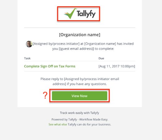
Look at that email. A guest receives it and sees: Tallyfy logo, Tallyfy green button, “Powered by Tallyfy” footer. For our brand awareness, great. For the company sending it? Their identity is buried.
The complaints came in consistently. As Pravina noted:
People have complained about the logo on the guest view and asked we can customize the guest and coworker emails.
Scoping down to sanity
When facing a mountain of feature requests, the instinct is to build everything. Resist that instinct.
I pushed for aggressive scoping:
I think all other elements of brand customization should be ignored at this point and this task can just be about the logo.
Just the logo. Not colors. Not terminology. Not white-labeling the entire product. Start with the thing that has the highest impact for the lowest complexity.
A custom logo in guest emails immediately signals “this is from your vendor” instead of “this is from some software your vendor uses.” That single change addresses 80% of the brand anxiety.
The color problem
Logos were straightforward. Colors were not.
A law firm running estate probate workflows - processes that stretch over 9 months with multiple client touchpoints - specifically asked about button colors. They wanted their corporate blue on every email and every guest-facing task. Simple enough, we thought. Then they asked: what happens when someone in their marketing department changes the brand color mid-process? Do existing workflows update? Do emails already sent retroactively change their appearance?
Thomas, our designer at the time, sketched out what seemed like a simple interface. Pick your brand color. See it applied to buttons and links. Done.
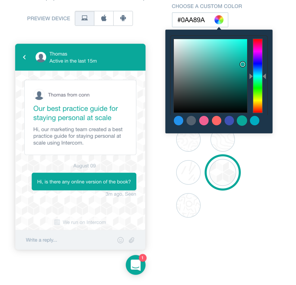
Thomas was specific about the experience we wanted:
I imagine the customization editor being as simple as this example.
And later, when we got deeper into implementation:
Provide the user the exact same “watch the preview change in realtime” experience as Intercom.
Real-time preview was non-negotiable. Honestly, nobody should have to save settings, send a test email, realize they hate it, go back, change settings, send another test email. That cycle is brutal. The preview must update instantly as you drag the color picker.
But real-time preview creates a problem: what happens when someone picks a terrible color?
The readability crisis
Here’s where CSS-driven branding gets dangerous.
Someone picks white (#FFFFFF) as their brand color. White buttons. White links. On a white background.
Invisible.
Someone picks light yellow (#FFFF99). Yellow button with white text. Unreadable.
Someone picks dark navy (#000033). Navy button with dark text. Also unreadable.
The design acceptance criteria spelled this out explicitly:
Any dark hex code means: Button text remains white, Link text will be exact hex code.
And:
Any light hex code means: Button text is dark gray, Link text will darken given hex code until it is acceptable.
So we needed to detect whether a color was “light” or “dark” and adjust the text accordingly. How do you define light versus dark programmatically?
Light and dark are defined in the code provided by our Client Lead: TinyColor getbrightness.
Brian Grinstead’s TinyColor is a small JavaScript library that can analyze colors. Its getBrightness() function returns a value from 0 (black) to 255 (white). We set a threshold - probably around 128 - and any color above that threshold counts as “light” and gets dark text, while any color below gets white text.
This is the kind of detail that sounds trivial until you realize every email, every button, every link needs to respect this rule. And you can’t just run JavaScript in an email - email clients strip scripts. Turns out, the color calculation has to happen at render time on the server, not in the browser.
The acceptance criteria continued:
Custom hex codes need a safeguard to ensure button text and links are readable.
Safeguard. Not suggestion. If someone picks a problematic color, we fix it automatically rather than letting them create an unusable interface.
What we would let them control
Thomas outlined the specific controls:
Brand controls could include: Logo your customer sees, Complete Button color, Email button color, Link color - can not be too light.
Notice that last caveat. Link color can’t be too light. Because links on white backgrounds need to be visible. And more than visible - they need to look like links. A light gray link doesn’t register as clickable.
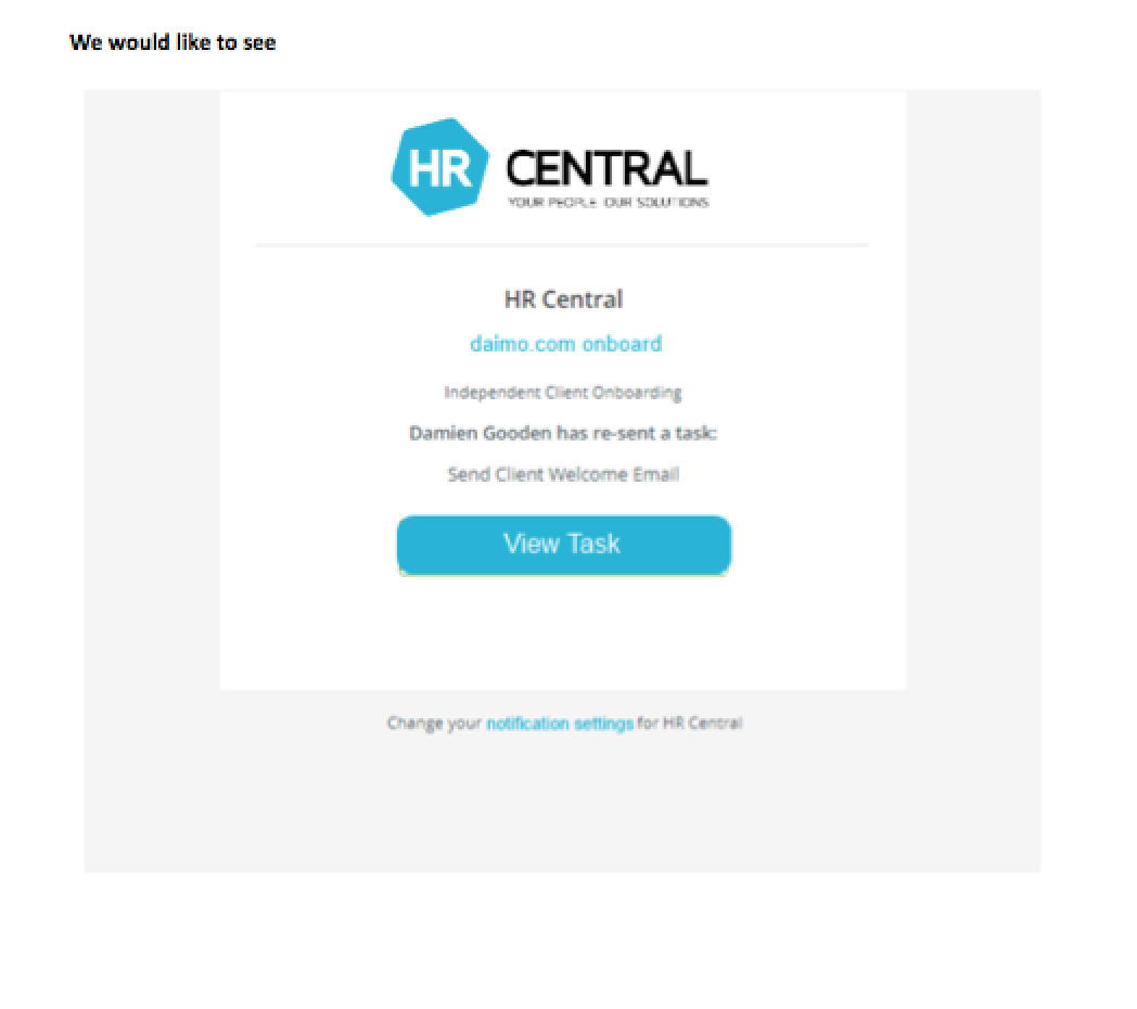
This mockup shows the goal. HR Central’s logo. Their blue color on the View Task button. The guest sees HR Central, not Tallyfy. The relationship stays intact.
Tiered approach
Not everyone gets everything. That was a deliberate product decision.
The white-labeling discussion made this explicit. For the PRO plan:
Remove Tallyfy marketing lines - complete white-labelling - in email shell and footer. For PRO plan.
BASIC plan users could customize their logo. PRO plan users could remove our branding entirely and customize colors. The complexity of the feature matched the investment level.
This isn’t just about revenue. It’s about support burden. Color customization creates edge cases. Every possible hex code creates a potential support ticket: “Why does my button look weird?” Full white-labeling means organizations own their brand presentation completely - including the problems.
At Tallyfy, we’ve seen that higher-tier organizations tend to have more sophisticated needs and more tolerance for configuration complexity. They also have dedicated account managers who can help troubleshoot. BASIC plan users want things to just work.
The terminology rabbit hole
One request kept coming up that we ultimately deferred:
Words “Process”, “Run”, “Task”, “To-do”, “Issue” etc. can be renamed to “Checklist”, “Copy”, “Item”.
Sounds simple. Just string replacement, right?
Wrong. Terminology lives everywhere. In the UI. In the emails. In the help documentation. In error messages. In tooltips. In placeholder text. A single word like “task” might appear in basically 200 different places across the product.
And grammar matters. “You have 3 tasks” versus “You have 3 items” works fine. But what about “This task is overdue” versus “This item is overdue”? What about “Complete task” as a button versus “Complete item”? Some replacements sound natural; others sound clunky.
We decided custom terminology was a different feature entirely. Brand colors affect presentation. Custom terminology affects comprehension. The risks are different, the implementation is different, and the support implications are different.
The forbidden color
Can people pick any color they want? Almost.
One color got special treatment: white.
White is forbidden.
Not because white is ugly. Because white is invisible. A white button on a white email background disappears. A white link on white text? Gone.
The safeguard logic has to catch this. If someone enters #FFFFFF or any color close enough to white, the system should either reject it or automatically darken it to something visible.
This seems obvious, but you’d be surprised. People pick white because their logo has white in it. People pick white because their brand guidelines say “clean and minimal.” People pick white because the color picker defaults to white and they just hit save without thinking.
The system has to protect users from themselves.
Implementation reality
Here’s what the actual implementation required:
Server-side color analysis. Every time brand settings are saved, run the hex code through TinyColor, calculate brightness, store both the original color and the computed text color variant.
Email template conditionals. Every email template needs logic: if brand color is set, use it; otherwise, default to Tallyfy green. If brand color is light, use dark text; otherwise, use white text.
Logo storage and serving. Organization logos need to be stored, resized appropriately for email (where width constraints are real), and served from a reliable CDN so emails don’t break when our servers hiccup.
Preview rendering. The settings page needs to render a live preview using the same logic the actual emails use. Not similar logic - the same logic. Otherwise, the preview lies.
Cache invalidation. When someone changes their brand settings, all cached email templates for that organization need to regenerate. Otherwise, some guests see the old branding and some see the new.
Fallbacks. What if the logo upload fails? What if the CDN is down? What if the color value somehow gets corrupted? Every path needs a safe fallback.
None of this is pioneering engineering. All of it takes time. And all of it creates surface area for bugs. Such is life in SaaS.
What we left out
Something I’ve noticed across industries is that brand customization has a natural tendency to expand. We had to actively resist.
Custom fonts. Some brands have specific typography. We didn’t support custom fonts because email font rendering is a nightmare. Most email clients ignore custom fonts entirely. The complexity wasn’t worth the inconsistent results.
Multiple color schemes. Some companies wanted different colors for different contexts - one color for external guests, another for internal tasks. We kept it to one brand color per organization.
Per-template branding. What if you want different branding for HR processes versus client-facing processes? Interesting idea. Significant complexity. Not in scope.
Dark mode variants. As dark mode became popular, the question arose: should brand colors adjust for dark backgrounds? We decided brand colors were brand colors - if someone picks blue, it stays blue regardless of the viewing context.
Animated logos. Some brands use animated GIFs or SVG animations in their logos. Email support for animation is inconsistent. We stuck with static images.
Each of these would’ve been a reasonable feature. Each would add engineering complexity, testing surface area, and support burden. Sometimes the best product decision is saying no.
The Intercom standard
Thomas kept coming back to Intercom as the gold standard for brand customization UX. They had figured out the interaction pattern: live preview, simple controls, instant feedback.
Provide the user the exact same “watch the preview change in realtime” experience as Intercom.
This wasn’t about copying a competitor. OK, maybe it was a little bit about copying. It was about recognizing that Intercom had already done the user research. They had already figured out that real-time preview matters. They had already learned that too many options confuse people. Learning from their work saved us from making the same mistakes.
The final implementation borrowed heavily from that interaction model. Pick a color. See it update. Pick a logo. See it appear. No save-and-refresh cycles. No guessing.
Lessons for SaaS branding
If you’re building brand customization into your product:
Start with guest-facing surfaces. Your paying users tolerate your brand. Their guests expect their vendor’s brand. Focus your energy where it matters most.
Implement color safeguards from day one. Do not let users pick colors that break readability. Brightness detection is straightforward - use it.
Tier the complexity. Simple customization for basic plans, full white-labeling for premium. Match the feature complexity to the user sophistication.
Build real-time preview. The save-test-adjust cycle is painful. Invest in live preview even though it’s harder to build.
Resist scope creep. Every branding request seems reasonable in isolation. Together, they create a monster. Pick your battles.
Document what you don’t support. When you say no to custom fonts or animated logos, write it down. Otherwise, you’ll have the same discussion every six months.
Brand customization is one of those features that people expect but rarely appreciate the complexity behind. The goal is invisible: when it works, guests see their vendor’s brand and never think about the software making it happen.
That invisibility is the whole point. And achieving it takes more engineering than anyone expects.
You can explore our current customization options in organization settings.
About the Author
Amit is the CEO of Tallyfy. He is a workflow expert and specializes in process automation and the next generation of business process management in the post-flowchart age. He has decades of consulting experience in task and workflow automation, continuous improvement (all the flavors) and AI-driven workflows for small and large companies. Amit did a Computer Science degree at the University of Bath and moved from the UK to St. Louis, MO in 2014. He loves watching American robins and their nesting behaviors!
Follow Amit on his website, LinkedIn, Facebook, Reddit, X (Twitter) or YouTube.

Automate your workflows with Tallyfy
Stop chasing status updates. Track and automate your processes in one place.