Quality improvements don’t happen by accident. They need to be tracked and measured with real process improvement tools.
Summary
- Kaoru Ishikawa created seven graphical tools in the 1950s - He wanted factory workers without statistics backgrounds to spot and fix quality problems on their own, through visual methods anyone can learn in minutes
- Each tool attacks a different kind of problem - Flow charts map processes, histograms show distributions, cause-and-effect diagrams trace root causes, check sheets collect data, scatter diagrams reveal relationships, control charts track stability, and Pareto charts prioritize what to fix first
- AI won’t save you if your processes are broken - Before throwing automation or AI at quality problems, these tools help you understand what’s actually going wrong. See how Tallyfy tracks process improvements
Tallyfy is Process Improvement Made Easy
Here’s something that drives me a bit crazy. Teams spend months picking fancy quality management software, arguing and bikeshedding over dashboards and integrations, but they skip the basics. The 7 basic quality tools that Kaoru Ishikawa developed in the 1950s still work. They’re graphical, they’re simple, and they don’t need a statistics degree to use.
Ishikawa was a professor of engineering at the University of Tokyo, and he had a specific problem to solve. Post-war Japanese factories were trying to adopt statistical quality control methods that W. Edwards Deming had introduced, but the complexity was scaring off workers. So Ishikawa boiled it all down to seven visual techniques that anyone on the shop floor could pick up.
That was decades ago. These tools still show up in every serious quality conversation I’ve been part of. After watching hundreds of teams try this with operations leaders across manufacturing, aviation, and professional services, these seven keep coming back.
Here’s the full list - nothing fancy, nothing hidden behind a paywall:
- Flow chart
- Histogram
- Cause-and-effect diagram
- Check sheet
- Scatter diagram
- Control chart
- Pareto chart
Each one does something specific. Let me walk through them.

Flow charts show where things actually break
Flow charts map out a series of events or steps so you can see how a process really works - not how people think it works.
That distinction matters more than you’d expect.
I’ve watched teams describe a process one way in meetings, then you map it out and the actual flow looks very different. Hidden handoffs, duplicate approvals, steps that exist because “we’ve always done it that way.”
They’re also the backbone of any decent workflow diagram. Once you see the whole thing visually, the bottlenecks jump out at you.
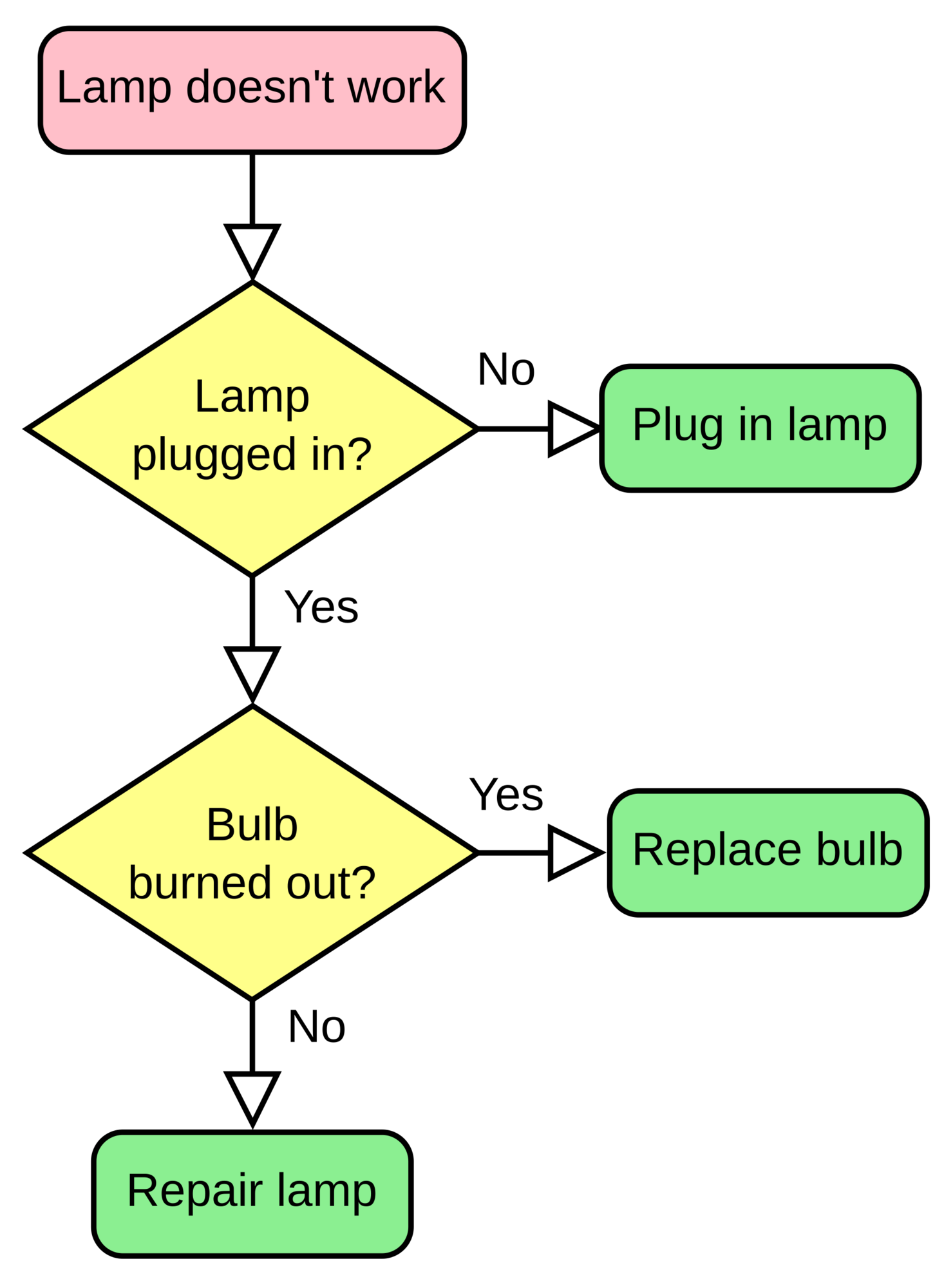
In Tallyfy, we took this idea further. Instead of drawing static flowcharts that nobody updates, you build living workflows that people actually run. But the principle is the same - make the process visible first.
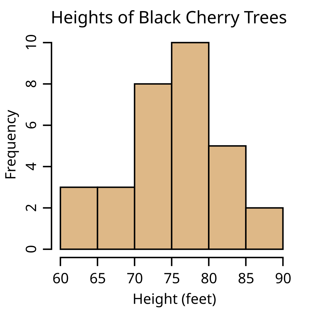
Histograms reveal patterns in your data
A histogram is a bar chart showing how data distributes across ranges. Normal distribution gives you a bell curve. Anything else tells you something interesting is going on.
If your histogram looks skewed, or has multiple peaks, or shows a flat distribution when you expected a bell curve - that’s not noise. That’s a signal. Maybe two different machines are producing slightly different results. Maybe your morning shift performs differently from your night shift. I’ve seen this exact pattern trip up manufacturing teams who assumed their process was consistent until the histogram told a different story.
You need at least two variables to make this useful. One axis shows the measurement ranges, the other shows frequency. The shape of the curve is where the insight lives. A bimodal distribution (two humps) usually means two distinct populations are mixed into your data. Separate them, and the real problem becomes obvious.
Cause-and-effect diagrams get to the root
Also called a fishbone diagram or an Ishikawa diagram (named after the man himself), this is probably the most recognizable of the seven tools.
You put the problem at the head of the fish. Then you draw bones for each category of potential cause - typically people, methods, machines, materials, measurements, and environment. Under each bone, you brainstorm specific causes.
It sounds almost too simple.
But here’s what it does that most troubleshooting misses: it forces you to think systematically about why something went wrong instead of jumping to the first explanation that sounds plausible.

Feedback we’ve received from operations teams suggests that the fishbone diagram is often the first tool people reach for when something goes sideways. It’s fast, it’s collaborative, and it prevents the “blame the last person who touched it” instinct.
Check sheets, scatter diagrams, and control charts
Check sheets are exactly what they sound like - structured forms that collect and organize data. You can build one in a spreadsheet in five minutes. The point isn’t sophistication. It’s consistency. When everyone records data the same way, you can actually analyze it later. Without consistent data collection, every other tool on this list becomes guesswork. I’d guess people underestimate check sheets because they’re boring. But boring is underrated when you’re trying to find patterns.
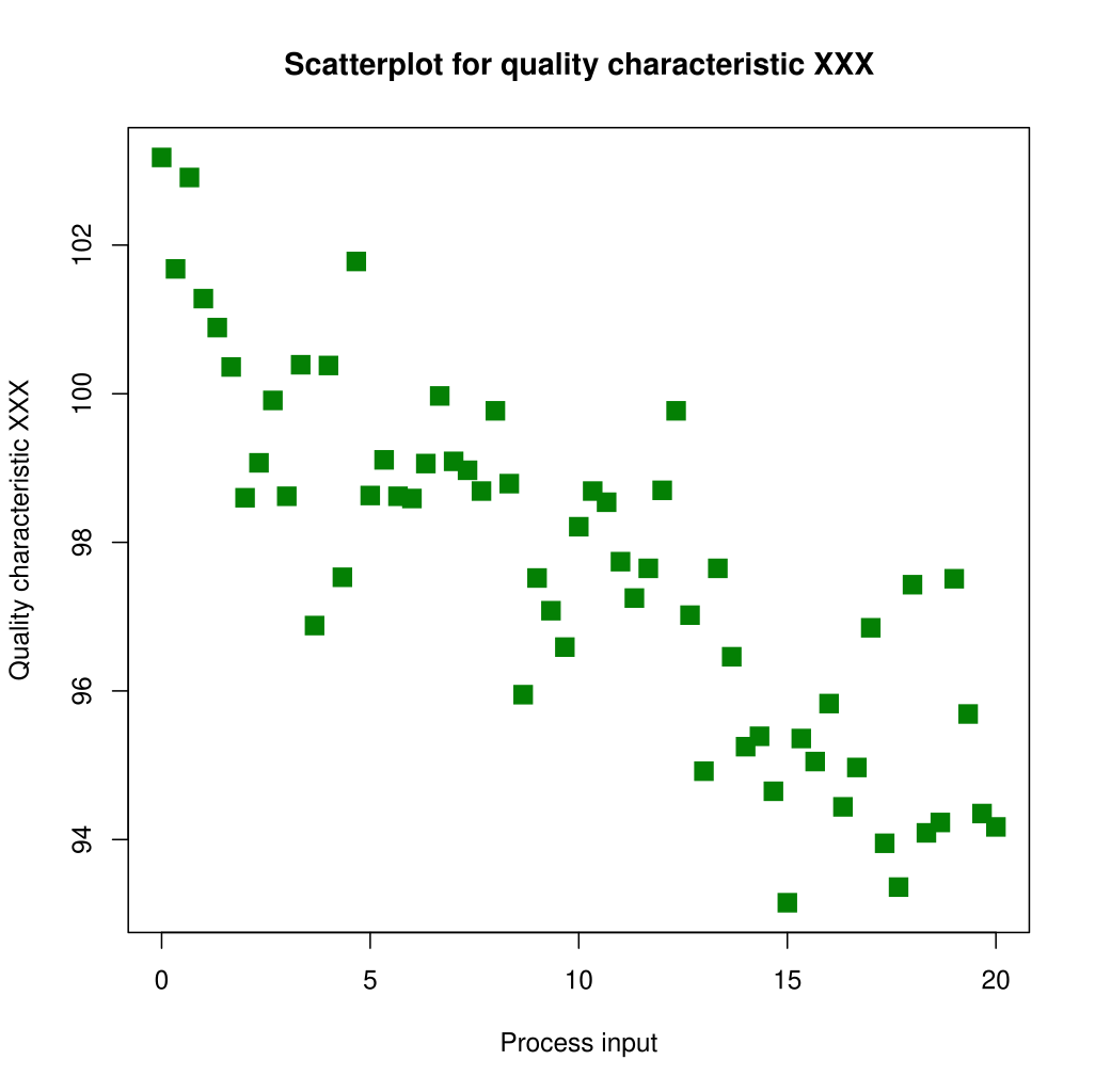
Scatter diagrams plot two variables against each other on a Cartesian plane. You’re looking for correlations. Does defect rate increase when temperature goes up? Does cycle time get worse as batch size grows? The dots tell the story. A tight cluster suggests a strong relationship. A scattered mess suggests you’re looking at the wrong variables - which is useful information too. Don’t just look for what correlates. Look for what doesn’t.
Control charts might, funnily enough, be the most useful of the seven. Walter Shewhart invented them at Bell Labs in 1924 to distinguish between normal process variation and something actually wrong. You plot your measurements over time with upper and lower control limits. Points within the limits? Normal variation, leave it alone. Points outside? Something changed. Go find out what.
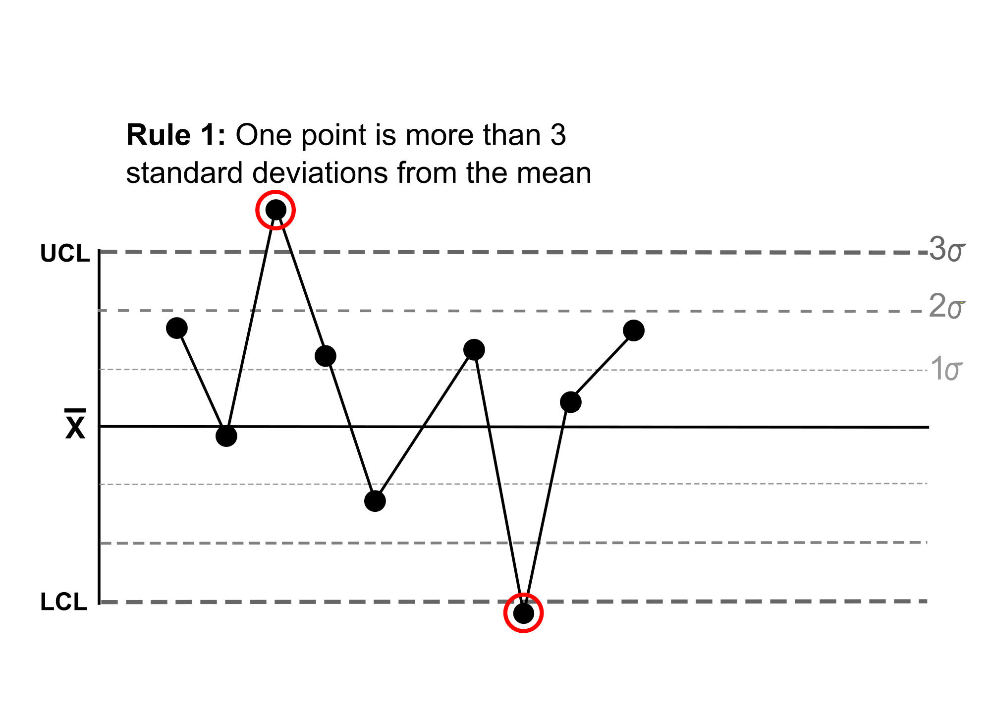
Teams tell us the same thing in different words. They use control chart thinking alongside workflow tracking to spot process drift before it turns into a quality incident. For what it’s worth, one aviation company we spoke with used them as part of their safety audit program to track corrective actions.
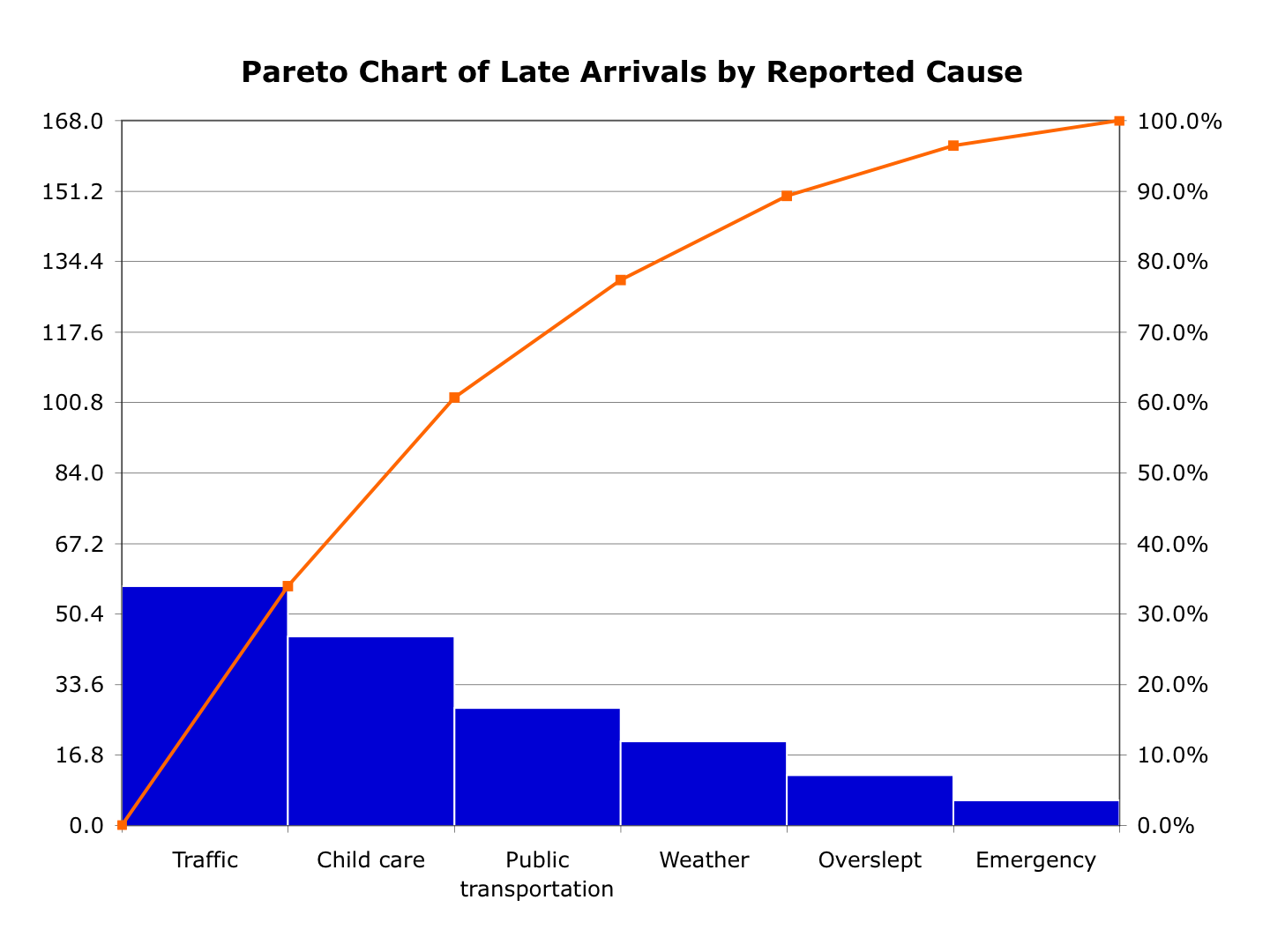
Pareto charts and the 80/20 rule
Pareto charts combine a bar chart with a line graph. Bars show individual causes sorted from biggest to smallest. The line shows cumulative percentage.
The idea comes from Joseph Juran’s adaptation of Vilfredo Pareto’s principle - roughly 80% of problems come from 20% of causes. OK, the exact ratio varies, but the pattern holds. Juran called these the “vital few.” Fix those, and you’ve handled most of the damage.
This is where prioritization happens. Instead of trying to fix everything at once, you focus your energy on the causes that produce the biggest impact. Simple math, massive results.
Why process definition matters before AI
Here’s the mega trend I keep returning to.
I’m not against AI in quality management. Far from it. But ASQ resources on continuous improvement confirm what we’ve observed at Tallyfy over and over - if your workflows are fragmented or undocumented, AI will just accelerate the confusion. And research suggests around 80% of AI projects fail not because the technology is bad, but because the operational foundations weren’t there. That should scare people more than it does.
These seven quality tools are the foundation. Use a fishbone diagram to understand why defects happen. Use a Pareto chart to prioritize which ones to fix. Use control charts to verify your fixes are working. Then - and only then - layer on automation.
Tallyfy sits right at that intersection. It gives you the process structure that AI needs to operate on. Without defined, trackable processes, you’re just automating chaos.
Making these tools work in practice
The beauty of Ishikawa’s tools is that they don’t require a Six Sigma black belt or a statistics PhD. They need a whiteboard, some data, and people who are willing to look at what’s actually happening instead of what they assume is happening.
Start small. Pick one process that’s been giving you trouble. Map it with a flow chart. Collect data with a check sheet for two weeks. Run a Pareto chart to see which issues show up most. Draw a fishbone diagram for the top issue. You’ll probably learn more in that exercise than you would in six months of meetings about “quality culture.”
We’ve heard the same story from dozens of operations leaders getting started with workflow automation - the teams that get the best results are the ones that start with these fundamentals. Document the process. Measure it. Find the root causes. Prioritize fixes. Track whether the fixes worked. It’s not glamorous, but it works. Based on hundreds of implementations, the pattern is consistent - teams that skip this step end up circling back to it anyway, usually after wasting time and money on tools they didn’t need yet.
One thing I’d add: don’t use all seven tools at once. Pick two or three that match the problem you’re dealing with. Investigating root causes? Fishbone and Pareto. Monitoring process stability? Control charts and check sheets. Trying to understand a relationship between two variables? Scatter diagram. The tools work best when you match them to specific questions.
My plain take? Most quality problems aren’t technical problems. They’re visibility problems. People can’t fix what they can’t see. Does fancy software fix that? No. These seven tools make the invisible visible, and that’s worth more than any AI dashboard.
Put quality tools into practice
These workflow templates help you set up systematic quality control and issue tracking in your organization.
